
RBIs are often criticized because they are largely dependent on how many plate opportunities the hitter gets with runners on base. Most analytics experts have dismissed RBIs as a dated stat, but many baseball insiders still claim that they have some relevance. We aim to address these flaws and create a stat that everyone can agree on.
Read MoreDo tired defensemen surrender more rebounds? /

Two thoughts popped into my mind, one after the other.
First, I wondered whether an NHL player’s performance fluctuated depending on how long they had been on the ice. Does short-term fatigue play a significant role over a single shift?
Second, I wondered how to quantify (and hopefully answer) this question.
The Data
Enter the wonderfully detailed shot dataset recently published by moneypuck.com. In it, we have over 100 features that describe the location and context of every shot attempt since the 2010-11 NHL season. You can find the dataset here: http://moneypuck.com/about.htm#data.
Within this data I found two variables to test my idea. First, the average number of seconds that the defending team’s defensemen had been on the ice when the attacking team’s shot was taken. The average across all 471,898 shots was 34.2 seconds, if you’re curious. With this metric I had a way to quantify the lifespan of a shift, but what variable could be used as a proxy for performance?
Fortunately, the dataset also says whether each shot was a rebound shot. To assess defensive performance, I decided to use the rate at which shots against were rebounds. Recovering loose pucks in your own end is a fundamental part of the job description for NHL defensemen, especially in response to your goalie making a save. Should the defending team fail to recover the puck, the attacking team could generate a rebound shot, which would often result in a goal against. We can see evidence of this in the 5v5 data:

Rebound shooting % is 3.6x larger than non-rebound shooting %
The takeaway here is that 24.1% of rebound shots go into the net, compared to just 6.7% of non-rebound shots. Rebounds are much closer to the net on average, which can explain much of this difference.
I believe that a player’s ability to recover loose pucks is a function of their ability to anticipate where the puck is going to be and their quickness to get to there first. While anticipation is a mental talent, quickness is physical, meaning that a defender’s quickness could deteriorate over the course of their shift as short-term fatigue sets in. Could their ability to prevent rebound shots be consequently affected? Let’s plot that relationship:

There’s a lot going on here, so let’s break it down.
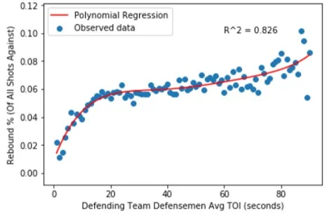
The horizontal axis shows the average shift length of the defending defense pairing at the time of the shot against. I cut the range off at 90 seconds because data became scarce after that; pairings normally don’t get stuck on the ice for more than a minute and a half at 5v5. The vertical axis shows what percentage of all shots against were rebounds.
Each blue dot represents the rebound rate for all shots that share a shift length, meaning that there are 90 data points, or one for each second. The number of total shots ranges from 382 (90 seconds) to 8,124 (27 seconds). Here’s the full distribution:

We can see that sample size is an inherent limitation for long shifts. The number of shots against drops under 1,000 for all shift lengths above 74 seconds, which means that the conclusions drawn from this portion of the data need to be taken with a grain of salt. This sample size issue also explains the plot’s seemingly erratic behaviour towards the upper end of the shift length range, as percentage rates of relatively rare events (rebounds) tend to fluctuate heavily in smaller sample sizes.
The Model
Next, I wanted to create a model to represent the trend of the observed data. The earlier scatter plot tells us that the relationship between shift length and rebound rate is probably non-linear, so I decided to use a polynomial function to model the data. But what should be this function’s degree? I capped the range of possibilities at degree = 5 to avoid over-fitting the data, and then set out to systematically identify the best model.
It’s common practice to split data into a training set and a testing set. I subjectively chose a split of 70-30% for training and testing, respectively. This means that the model was trained using 70% of all data points, and then its ability to predict previously unseen data was measured using the remaining 30%. Model accuracy can be measured by any number of metrics, but I decided to use the root mean squared error (RMSE) between the true data points and the model’s predictions. RMSE, which penalizes large model errors, is among the most popular and commonly-used error functions. I conducted the 70-30 splitting process 10,000 times, each time training and testing five different models (one each of degree 1, 2, 3, 4, and 5). Of the five model types, the 5th degree function produced the lowest root mean squared error (and therefore the highest accuracy) more often than the degree 1, 2, 3 or 4 functions. This tells us that the data is best modelled by a 5th degree polynomial. Fitting a normalized 5th degree function produced the following equation:

x = shift length in seconds
This equation is less interesting than the curve that it represents, so let’s look at that:
What Does It Mean?
The regression appears to generally do a good job of fitting the data. Our r-squared value of 0.826 tells us that ~83% of the variance in ‘Rebound %’ is explained by defensemen shift length, which is encouraging. Let’s talk more about the function’s shape.

Rebound rate first differences decrease at first as the rate stabilizes, and then increase further
As defense pairings spend more time on the ice, they tend to surrender more rebound shots, meaning that they recover fewer defensive zone loose pucks. Pairings who are early in their shift (< 20 seconds) surrendered relatively few rebound shots, but there's likely a separate explanation for this. It's common for defensemen to change when the puck is in other team’s end, meaning that their replacements often get to start shifts with the puck over 100 feet away from the net they're defending. For a rebound shot to be surrendered, the opposing team would need to recover possession, transition to offense, enter the zone and generate a shot. These events take time, which likely explains why rebound rates are so low in the first 15-20 seconds of a shift.
We can see that rebound rates begin to stabilize after this threshold. The rate is most flat at the 34 second mark (5.9%), after which the marginal rate increase begins to grow for each additional second of ice time. This pattern of increasing steepness can be seen in the ‘Rebound Rate Increase’ column of the above chart and likely reflects the compounding effects of short-term fatigue felt by defensemen late in their shifts, especially when these shifts are longer than average. The sample size concerns for long shifts should again be noted, as should the accompanying skepticism that our long-shift data accurately represent their underlying phenomenon.
The main strategic implications of these findings relate to optimal shift length. The results confirm the age-old coaching mantra of ‘keep the shifts short’, showing a positive correlation between shift length and rebound rates. Defensemen shift lengths should be kept to 34 seconds or less, ideally, since the data suggests that performance declines at an increasingly steep rate beyond this point. Further investigation is needed, however, before one can conclusively state that this is the optimal shift length.
Considering that allowing 4 rebound shots generally translates to a goal against, it’s strategically imperative to reduce rebound shot rates by recovering loose pucks in the defensive zone. Better-rested defensemen are better able to recover these pucks, as suggested by the strong, positive correlation between defensemen shift length and rebound rates. While further study is needed to establish causation, proactively managing defensive shift lengths appears to be a viable strategy to reduce rebound shot rates.
Any hockey fan could tell you that shifts should be kept short, but with the depth of available data we're increasingly able to figure out exactly how short they should be.
Cover photo credited to Sergei Belski — USA Today Sports
In search of similarity: Finding comparable NHL players /

The following is a detailed explanation of the work done to produce my public player comparison data visualization tool. If you wish to see the visualization in action it can be found at the following link, but I wholeheartedly encourage you to continue reading to understand exactly what you’re looking at:
https://public.tableau.com/profile/owen.kewell#!/vizhome/PlayerSimilarityTool/PlayerSimilarityTool
NHL players are in direct competition with hundreds of their peers. The game-after-game grind of professional hockey tests these individuals on their ability to both generate and suppress offense. As a player, it’s almost guaranteed that some of your competitors will be better than you on one or both sides of the puck. Similarly, you’re likely to be better than plenty of others. It’s also likely that there are a handful of players league-wide whose talent levels are right around your own.
The NHL is a big league. In the 2017-18 season, 759 different skaters suited up for at least 10 games, including 492 forwards and 267 defensemen. In such a deep league, each player should be statistically similar to at least a handful of their peers. But how to find these league-wide comparables?
Enter a bit of helpful data science. Thanks to something called Euclidean distance, we can systemically identify a player’s closest comparables around the league. Let’s start with a look at Anze Kopitar.

Anze Kopitar's closest offensive and defensive comparables around the league
The above graphic is a screenshot of my visualization tool.
With the single input of a player’s name, the tool displays the NHL players who represent the five closest offensive and defensive comparables. It also shows an estimate of the strength of this relationship in the form of a similarity percentage.
The visualization is intuitive to read. Kopitar’s closest offensive comparable is Voracek, followed by Backstrom, Kane, Granlund and Bailey. His closest defensive comparables are Couturier, Frolik, Backlund, Wheeler, and Jordan Staal. All relevant similarity percentages are included as well.
The skeptics among you might be asking where these results come from. Great question.
A Brief Word on Distance
The idea of distance, specifically Euclidean distance, is crucial to the analysis that I’ve done. Euclidean distance is a fancy name for the length of the straight line that connects two different points of data. You may not have known it, but it’s possible that you used Euclidean distance during high school math to find the distance between two points in (X,Y) cartesian space.
Now think of any two points existing in three-dimensional space. If we know the details of these points then we’re able to calculate the length of the theoretical line that would connect them, or their Euclidean distance. Essentially, we can measure how close the data points are to each other.
Thanks to the power of mathematics, we’re not constrained to using data points with three or fewer dimensions. Despite being unable to picture the higher dimensions, we've developed techniques for measuring distance even as we increase the complexity of the input data.
Applying Distance to Hockey
Hockey is excellent at producing complex data points. Each NHL game produces an abundance of data for all players involved. This data can, in turn, be used to construct a robust statistical profile for each player.
As you might have guessed, we can calculate the distance between any two of these players. A relatively short distance between a pair would tell us that the players are similar, while a relatively long distance would indicate that they are not similar at all. We can use these distance measures to identify meaningful player comparables, thereby answering our original question.
I set out to do this for the NHL in its current state.
Data
First, I had to determine which player statistics to include in my analysis. Fortunately, the excellent Rob Vollman publishes a data set on his website that features hundreds of statistics combed from multiple sources, including Corsica Hockey (http://corsica.hockey/), Natural Stat Trick (https://naturalstattrick.com) and NHL.com. The downloadable data set can be found here: http://www.hockeyabstract.com/testimonials. From this set, I identified the statistics that I considered to be most important in measuring a player’s offensive and defensive impacts. Let’s talk about offense first.

List of offensive similarity input statistics
I decided to base offensive similarity on the above 27 statistics. I’ve grouped them into five categories for illustrative purposes. The profile includes 15 even-strength stats, 7 power-play stats, and 3 short-handed stats, plus 2 qualifiers. This 15-7-3 distribution across game states reflects my view of the relative importance of each state in assessing offensive competence. Thanks to the scope of these statistical measures, we can construct a sophisticated profile for each player detailing exactly how they produce offense. I consider this offensive sophistication to be a strength of the model.
While most of the above statistics should be self-explanatory, some clarification is needed for others. ‘Pass’ is an estimate of a player’s passes that lead to a teammate’s shot attempt. ‘IPP%’ is short for ‘Individual Points Percentage’, which refers to the proportion of a team’s goals scored with a player on the ice where that player registers a point. Most stats are expressed as /60 rates to provide more meaningful comparisons.
You might have noticed that I double-counted production at even-strength by including both raw scoring counts and their /60 equivalent. This was done intentionally to give more weight to offensive production, as I believe these metrics to be more important than most, if not all, of the other statistics that I included. I wanted my model to reflect this belief. Double-counting provides a practical way to accomplish this without skewing the model’s results too heavily, as production statistics still represent less than 40% of the model’s input data.
Now, let's look at defense.

List of defensive similarity input statistics
Defensive statistical profiles were built using the above 19 statistics. This includes 15 even-strength stats, 2 short-handed stats, and the same 2 qualifiers. Once again, even-strength defensive results are given greater weight than their special teams equivalents.
Sadly, hockey remains limited in its ability to produce statistical measurements of individual defensive talent. It’s hard to quantify events that don’t happen, and even harder to properly identify the individuals responsible for the lack of these events. Despite this, we still have access to a number of useful statistics. We can measure the rates at which opposing players record offensive events, such as shot attempts and scoring chances. We can also examine expected goals against, which gives us a sense of a player’s ability to suppress quality scoring chances. Additionally, we can measure the rates at which a player records defense-focused micro-events like shot blocks and giveaways. The defensive profile built by combining these stats is less sophisticated than its offensive counterpart due to the limited scope of its components, but the profile remains at least somewhat useful for comparison purposes.
Methodology
For every NHLer to play 10 or more games in 2017-18, I took a weighted average of their statistics across the past two seasons. I decided to weight the 2017-18 season at 60% and the 2016-17 season at 40%. If the player did not play in 2016-17, then their 2017-18 statistics were given a weight of 100%. These weights represent a subjective choice made to increase the relative importance of the data set’s more recent season.
Having taken this weighted average, I constructed two data sets; one for offense and the other for defense. I imported these spreadsheets into Pandas, which is a Python package designed to perform data science tasks. I then faced a dilemma. Distance is a raw quantitative measure and is therefore sensitive to its data’s magnitude. For example, the number of ‘Games Played’ ranges from 10-82, but Individual Points Percentage (IPP%) maxes out at 1. This magnitude issue would skew distance calculations unless properly accounted for.
To solve this problem, I proportionally scaled all data to range from 0 to 1. 0 would be given to the player who achieved the stat’s lowest rate league-wide, and 1 to the player who achieved the highest. A player whose stat was exactly halfway between the two extremes would be given 0.5, and so on. This exercise in standardization resulted in the model giving equal consideration to each of its input statistics, which was the desired outcome.
I then wrote and executed code that calculated the distance between a given player and all others around the league who share their position. This distance list was then sorted to identify the other players who were closest, and therefore most comparable, to the original input player. This was done for both offensive and defensive similarity, and then repeated for all NHL players.
This process generated a list of offensive and defensive comparables for every player in the league. I consider these lists to be the true value, and certainly the main attraction, of my visualization tool.
Not satisfied with simply displaying the list of comparable players, I wanted to contextualize the distance calculations by transforming them into a measure that was more intuitively meaningful and easier to communicate. To do this, I created a similarity percent measure with a simple formula.

In the above formula, A is the input player, B is their comparable that we’re examining, and C is the player least similar to A league-wide. For example, if A->B were to have a distance of 1 and A->C a distance of 5, then the A->B similarity would be 1 - (1/5), or 80%. Similarity percentages in the final visualization were calculated using this methodology and provide an estimate of the degree to which two players are comparable.
Limitations
While I wholeheartedly believe that this tool is useful, it is far from perfect. Due to a lack of statistics that measure individual defensive events, the accuracy of defensive comparisons remains the largest limitation. I hope that the arrival of tracking data facilitates our ability to measure pass interceptions, gap control, lane coverage, forced errors, and other individual defensive micro-events. Until we have this data, however, we must rely on rates that track on-ice suppression of the opposing team’s offense. On-ice statistics tend to be similar for players who play together often, which causes the model to overstate defensive similarity between common linemates. For example, Josh Bailey rates as John Tavares’ closest defensive comparable, which doesn’t really pass the sniff test. For this reason, I believe that the offensive comparisons are more relevant and meaningful than their defensive counterparts.
Use Scenarios
This tool’s primary use is to provide a league-wide talent barometer. Personally, I enjoy using the visualization tool to assess relative value of players involved in trades and contract signings around the league. Lists of comparable players give us a common frame through which we can inform our understanding of an individual's hockey abilities. Plus, they’re fun. Everyone loves comparables.
The results are not meant to advise, but rather to entertain. The visualization represents little more than a point-in-time snapshot of a player’s standing around the league. As soon as the 2018-19 season begins, the tool will lose relevance until I re-run the model with data from the new season. Additionally, I should explicitly mention that the tool does not have any known predictive properties.
If you have any questions or comments about this or any of my other work, please feel free to reach out to me. Twitter (@owenkewell) will be my primary platform for releasing all future analytics and visualization work, and so I encourage you to stay up to date with me through this medium.
Cover photo credited to Jae C. Hong — Associated Press
Analysis: How five elite scorers get their goals /

There’s something beautiful about scoring a goal.
Goals are the building blocks that make up hockey success, both on the individual and team level. They are a single moment in time, a culmination of a series of plays that ends with one team’s attack successfully defeating the other’s defense.
Teams are forever searching to add goals to their lineup, and for good reason. Goals win games, playoff series and, eventually, championships.
Goal-scoring is a repeatable talent, and while certain NHLers are far better at it than others, each player does it their own way. Each scorer exhibits unique tendencies of shot type selection and shot location.
Alex Ovechkin, Evgeni Malkin, Connor McDavid, Nikita Kucherov, and Patrik Laine are five of the best scorers in the game. Of the 10 goal leaders for the 2017-18 season, these five players possess the highest career goals per game rates. They are the elite of the elite when it comes to putting the puck into NHL nets.
I wanted to explore how they each do it differently.

The above visualization separates by shot type to show how each player scored their goals in the 2017-18 season. Overall, the most popular shot type was wrist shot, followed by snap shot, slap shot, and finally backhand.
It should be noted that the ‘AVG (10+ G Forwards)’ represents a weighted average of the relevant shot rate among all forwards who scored 10 or more goals, weighted by the number of goals that they scored. It’s a way to quantify ‘normal’ rates for the league’s goal scoring forwards.
Let’s take a more detailed look at each of these five players.
Alex Ovechkin


It’s no secret that Alex Ovechkin is really good at scoring goals. Since breaking into the league, he’s won the scoring title 7 times and no one else has won it more than twice. Sitting at 607 career goals, Ovi continues to propel himself further up the list of all-time greats. His 0.605 goals per game ranks first league-wide, beating out all other forwards by at least 0.08 G/GP.
Ovechkin loves slap shots, which should come as no surprise to anyone who’s watched Washington’s power play operate. His 17 slap shot goals were an uncontested 1st league-wide, with Steven Stamkos being the only other forward to score more than 7. Ovechkin’s slap shot is so powerful that it beats goalies clean even whey they know it’s coming, meaning that it can be unleashed without needing to be disguised.
Equally noteworthy, Ovechkin scored just 31% of his goals by wrist shot, which represents the lowest rate among all 32 players who scored 30+ goals.

Heat Map courtesy of Micah Blake McCurdy's website HockeyViz (https://hockeyviz.com)
The red areas in the above heat map show where Ovechkin shoots more frequently than the rest of the league. Ovechkin makes an absolute killing at the top of the left faceoff circle, often referred to as the ‘Ovi Spot’. This area lines up with Ovechkin’s average shot distance of 32.3 feet, which ranked in the 80th percentile among the league’s forwards.
Although it’s not reflected in the heat map, much of Ovechkin’s damage is done with the man advantage playing the left point. Of his 49 goals, 17 were scored on the power play, which ranked 2nd only behind a player further down this list. His remaining 32 were scored at even-strength, which again ranked 2nd in the league. Elite scoring across both special teams and even-strength situations throughout his career has propelled Ovechkin to the status of the league’s premier goal scorer.
Evgeni Malkin
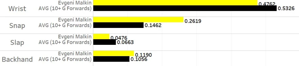

Despite being the second-best player on his team, Malkin has put together the resume of an elite goal scorer. He’s scored 75 goals in 140 games over the past two seasons, which converts to 44 goals over an 82-game season. His career goals per game of 0.472 ranks 6th among active forwards, placing him in elite company.
What makes Malkin dangerous is his offensive versatility; he can score from anywhere on the ice. Equal parts power and precision, Malkin possesses a variety of weapons. His snap shot goal rate clocks in at roughly double the league average (his 11 snap shot goals ranked 4th), but his middle-of-the-pack rates for wrist shots, slap shots and backhands speak to his balanced toolkit. Malkin does not rely on a single shot type to score goals, meaning that defenders must respect all shot types that Malkin credibly threatens.

Heat Map courtesy of Micah Blake McCurdy's website HockeyViz (https://hockeyviz.com)
Did I mention that Malkin can score from anywhere? The sea of red is the beauty of Evgeni Malkin. He’s one of the most complete offensive players in the league. In addition to his heavy shot, his slick puck-handling ability and power forward frame allow him to generate shots and scoring chances at elite rates in the low slot area. His shot distance ranked just inside the upper third league-wide, influenced both by his crease-area chances and his shot activity in the high slot.
Malkin joins Ovechkin as the only two players in the league to finish top-10 in both even-strength goals and power play goals. He scored 28 times at evens, ranking 7th, and 14 times with the man advantage, ranking 6th. Malkin is one of the game’s most dangerous players in the offensive zone, and his goal scoring abilities rank among the NHL’s elite.
Connor McDavid


At this point, not much more needs to be said about Connor McDavid’s offensive game. His 108 points were enough for a second consecutive Art Ross (but not Hart) Trophy. He’s the been the league’s best forward for the last two years, and he’s only 21 years old.
But is he a goal scorer? While it’s true that McDavid has been viewed more as a set-up man than a finisher thus far in his young career, in 2017-18 we saw a transformation in McDavid’s offensive role. Compared to the year prior, McDavid scored 11 more goals and took 23 more shots. He became more of a trigger man, electing to attempt shots more often instead of looking to pass. This development calls to mind a young Sidney Crosby, who recorded seasons of 70 and 84 assists before breaking out for 51 goals in 2009-10.
McDavid prefers to score goals with his wrist shot. His 25 wrist shot goals ranked 3rd league-wide behind only Nathan MacKinnon and Eric Staal, while his rate of 61% ranked 9th among the 32 players who scored 30+ goals. He hardly ever takes slap shots, registering just 7 of these shots during the entire season, of which just 1 beat the goalie. Rather than rely on strength to generate power, McDavid creates offense thanks to generational skating and elite-level hands. He’s able to create and navigate space better than anyone else on the planet and puts himself into positions where a quick and accurate wrist shot is more than enough to beat the goalie.

Heat Map courtesy of Micah Blake McCurdy's website HockeyViz (https://hockeyviz.com)
McDavid has figured out hockey’s (not-so) secret formula: if you get close to the net, you’re more likely to score. He's extremely effective at using his speed, hands, and vision to attack the most dangerous area of the ice. McDavid’s sub-20’ average shot distance is a testament to his elite ability to generate scoring chances from the crease and low slot area.
McDavid’s special teams split is intriguing. His 35 even-strength goals ranked first in the entire NHL, but his 5 power play goals tied him for 96th among forwards. This latter can be explained both by Edmonton’s league-worst power play and also McDavid’s primary role as a puck distributor on the top unit. If Edmonton’s power play improves, which is likely given regression to the mean, McDavid’s special teams goal-scoring could very well take a step forward and supplement his elite even-strength scoring totals. He is already the game’s best forward and he poses a legitimate threat to become the game’s best scorer sooner rather than later.
Nikita Kucherov


A late 2nd round pick, Nikita Kucherov has emerged from relative anonymity to become one of the league’s most dangerous forwards. His 79 goals over the past two seasons place 3rd league-wide, and he was one of just three players to break 100 points in 2017-18.
While Kucherov’s absurdly accurate wrist shot remains his primary weapon (4th in wrist shot goals with 24), he is equally dangerous on the backhand. He scored 8 times (21% of all goals) on his backhand, ranking 2nd among 30+ goal scorers to Brad Marchand in both raw total and rate. Kucherov’s ability to score using wrist shots and backhands is all the more impressive considering that he shoots from further away than 93% of other forwards. He can be successful from this range without relying on the power of slap and snap shots due to his innate ability to find and exploit tiny gaps that goaltenders leave open. His shots are precise and accurate, and he excels at finding any available daylight.

Heat Map courtesy of Micah Blake McCurdy's website HockeyViz (https://hockeyviz.com)
An incredibly versatile player, Nikita Kucherov generates shots at elite rates all over the mid and high-slot. Rather than favour a specific shooting location, he elects to test the goalie from all areas of the offensive zone. This makes Kucherov unpredictable, which helps explain why his quick-release wrist shot and backhand are so devastating. He doesn’t shoot much from the crease area, but driving the net really isn’t part of how he creates offense.
Kucherov was more of a goal-scorer at even-strength than on the power play in 2017-18. He recorded 31 ES goals, one of just four players to crack 30, compared with 8 on the man advantage. He played more of a set-up role on Tampa Bay’s 3rd-ranked power play, registering 28 assists as he regularly sent cross-ice passes to Steven Stamkos (15 PP goals). Kucherov’s outstanding season cemented his status as one of the most dangerous goal scorers in the NHL, and at the prime age of 25 he’s as good a bet as any to repeat his offensive dominance next season.
Patrik Laine


At just 20 years old, Patrik Laine is already among the game’s premier snipers. His 44 goals ranked 2nd league-wide in 2017-18, fueling the Jets to their franchise-best season. Laine’s biggest asset is his shot, which may very well be the best in the league. Among current NHLers with 50+ career goals, Patrik Laine’s career shooting percentage of 18.0% ranks 2nd behind only Paul Byron. Byron, meanwhile, had an average shot distance of 19.3 feet in 2017-18, least of all eligible forwards, while Laine’s average shot came from 36.1 feet, ranking in the 97th percentile. The kid can shoot the puck.
Laine’s weapon of choice is his snap shot, which he routinely uses to one-time pucks into the back of the net. His quick release and accurate shot placement resulted in 14 snap shot goals in 2017-18, which tied for the league lead with Phil Kessel. He also is a fan of the slap shot, with his 6 slap shot goals placing him in a tie for 4th among all forwards.

Heat Map courtesy of Micah Blake McCurdy's website HockeyViz (https://hockeyviz.com)
Here we see Laine’s favourite shooting locations. A right-handed shot, Laine loves to one-time pucks from the high slot. The fact that he’s able to beat the goalie so consistently from so far away speaks to his talent as a shooter. Like Ovechkin, Laine’s shooting locations lack variety, but he’s so good from his spots that goalies have difficulty stopping the shot even if they can anticipate that it’s coming.
The triggerman for the Jets’ 5th-ranked power play, Laine lead all NHLers with 20 power play goals in 2017-18. He would routinely patrol the space between the left half-wall and left point, making himself open to cross-seam passes and one-timing his quick snapshot on net. His 24 even-strength goals tied for 20th in the league, so he’s no slouch at 5-on-5 scoring either.
Since breaking into the league, Laine has used his generational shot to pick apart opposing goalies. The odds-on favourite to inherit Ovechkin’s throne as best goal-scorer is the league, the sky’s the limit for a kid who potted 44 goals in just his second season in the league.
Conclusion
So there we have it; the modus operandi of five of the game’s elite. While Ovechkin, Malkin, McDavid, Kucherov, and Laine possess a shared gift for putting the puck in the net, they achieve it with vastly different sets of techniques, skills, and strategies. There is no uniform way to score a goal across the league, but all that matters is that it goes in.
With goals representing the currency of the NHL, goal-scorers are among the most valuable assets out there. Scoring goals wins you games, playoff series, and, as 32-year old Alex Ovechkin and 31-year-old Evgeni Malkin know, Stanley Cup championships. Kucherov (25), McDavid (21), and Laine (20) have not yet won hockey’s ultimate prize but given their relative youth and their otherworldly ability to put the puck in the net, they might not be far away.
Data courtesy of Hockey Abstract (http://hockeyabstract.com/testimonials), Natural Stat Trick (https://naturalstattrick.com), and NHL.com (https://nhl.com)
Shot heat maps courtesy of Micah Blake McCurdy’s wonderful visualization website HockeyViz (https://hockeyviz.com)
Cover photo credited to NHL.com
Does goalie rest help win a Cup? /

On Thursday night, two third period goals scored in quick succession proved to be all that the Washington Capitals needed to defeat the Vegas Golden Knights. In doing so, they became champions, and the core built around Alex Ovechkin finally earned the right to lift the Cup after years of bitter playoff disappointment.
At some point in the Cup Final, I recall reading that both Braden Holtby and Marc-Andre Fleury played relatively few regular season games compared to most starting goalies. I looked it up, and it’s true. Holtby ranked 18th among goalies in TOI this past season, while Fleury came in at 25th.
The two goalies who made it furthest in the 2018 playoffs had a relatively light regular season workload. Could this be more than coincidence? Could a lighter workload directly translate into improved playoff performance? My first thought on the matter was that a goalie who played fewer regular season games would experience less fatigue, and so would be better suited for a long and grueling playoff run. Intuitively, this theory is pleasantly logical, but does it hold any merit?
The data
To tackle this question systematically, I examined the number of regular season games played by starting goalies of all playoff teams dating back to the 2007-08 season. I defined a playoff run’s starting goalie as the goalie who played the most minutes for that team in that playoff run. I grouped the goalies by the number of series that their teams won, thus separating goalies by degree of playoff success. I then looked at the number of regular season games played by the goalies in each group.
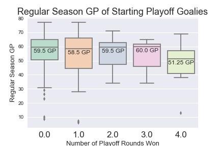
Cup-winning goalies tend to play 7-9 fewer regular season games
The numbers in the coloured boxes show the median GP value for all starting goalies whose teams won the number of playoff series found on the horizontal axis. It’s worth noting that I prorated games played for the lockout-shortened 2013 season as if it were a standard 82 game season.
Interestingly, when we group by degree of playoff success, we can see that the goalies who went on to win the Stanley Cup generally played fewer regular seasons games than did the goalies who went on to be eliminated at one point or another. This certainly supports the hypothesis that having your starter play fewer games would help your chances in the playoffs. Let’s take a closer look at these Cup-winning goalies.

Regular season workload of Cup-winning goalies
Of these 11 goalies, only 2 appeared in 60 or more regular season games: Jonathan Quick’s 69 games in 2011-12, and Marc-Andre Fleury’s 62 games in 2008-09. Comparatively, this rate of 2/11 is quite low:

Cup-winning goalies reach 60+ GP less frequently than any other group
Only 18.2% of Cup-winning goalies reached 60+ GP, while 47.2% of all playoff starters reached the same threshold. The difference between the two figures is stark, but let’s remember that sample size is a crucial piece of context. Due to the nature of awarding a title, we can only glean a single data point per season. As such, we have just 11 data points, and that’s including 2017-18 Braden Holtby.
We can’t ignore the possibility that Group 4’s low rate of 18.2% was caused by chance. If we were to simulate 11 random trials that each independently had a 47.2% chance of producing a certain outcome, as we established is league average for hitting 60 GP, the binomial distribution tells us that there’s a 4.8% chance that 2 or fewer of the trials would produce the desired outcome. In other words, there’s a 4.8% chance that the observed statistical phenomenon can be completely explained by random chance.
Shifting perspective, this also means that there’s a 95.2% chance that the result is not entirely attributable to chance, and there’s that at least some form of relationship that exists between a goalie’s workload and their likelihood of winning a Stanley Cup. The results, though produced in a small sample size, certainly suggest that a goalie being well-rested contributes to their ability to lead their team to a championship.
So I should rest my goalie, but when?
This was my follow-up question. Accepting that a well-rested goalie is an ingredient in the Stanley Cup recipe, does it matter when that rest happens during the season?
To highlight patterns in the workload of the same 11 Cup-winning goalies, I split each of their regular seasons into thirds (Games 1-27, 28-55, and 56-82) using schedule data from https://www.hockey-reference.com. For each section of games, I examined the starter’s proportion of their team’s total goaltending minutes. For example, in Games 1-27 of Washington’s 2017-18 season, Holtby played 1162:34, which was 71.5% of all TOI for Washington goalies. The chart below shows data for all goalies, including a group median.

Cup-winning goalies tend to have their lightest workload in the season's middle third
Cup-winning starters tend to play a larger proportion of their team’s minutes during the first third (Games 1-27) and the last third (Games 56-82) of the regular season. Comparatively, during Games 28-55, they tend to play about 7% less frequently. The emphasis on the beginning and end of the season is logical: a team must win games early to build a comfortable position in the standings, and a team must win games late to enter the playoffs firing on all cylinders.
This chart suggests that the best time to rest a starting goalie is during the middle third of the season. This is not an inflexible rule, however, as we can see that there are many ways to structure rest over the course of a season and experience playoff success. Holtby, for what it’s worth, was at his busiest during the middle third of this past season and was still able to remain sharp throughout the playoffs.
Conclusion and takeaways
Over the last decade, we’ve seen well-rested goalies lift the Stanley Cup more often than not. The empirical data support the notion that resting starters more frequently, particularly in the middle third of the season, will increase the likelihood of playoff success. This means that NHL coaching staffs with championship aspirations could gain an advantage by proactively managing their starter’s workload throughout the season.
Over-reliance on a starting goalie induces fatigue and invites the risk of said goalie being unable to maintain their performance over a two-month playoff run. While teams with strong starting goalies have tendencies to lean on them heavily throughout the regular season, this may be detrimental to championship aspirations. If a coach truly wanted to maximize their team’s Stanley Cup chances, they must ensure that their starting goalie is rested enough to maintain physical and mental focus over an extended playoff run. If this can be done, the team will be one step closer to hockey’s ultimate prize.
All data taken from Natural Stat Trick (https://www.naturalstattrick.com/) unless otherwise specified
Cover photo credited to John Locher — Associated Press
Investigating the disappearance of Vegas’ first line /

The Golden Knights kept finding ways to pull it off. Driven by all-world goaltending, an opportunistic counter-attack, and the desire to prove the rest of the hockey world wrong (especially their former teams), the group that James Neal affectionately dubbed the ‘Golden Misfits’ put together a Cinderella run through the Western Conference and into the Stanley Cup Final.
Only midnight appears to be approaching faster than anticipated.
After a 6-2 loss at the hands of the Washington Capitals yesterday, the Golden Knights find themselves searching for answers as their first elimination game in franchise history looms. The last three games, which Vegas has lost by a combined score of 12-5, featured a team that appeared much different from the group we saw roll their way through the Western Conference and into a 1-0 Stanley Cup Final lead.
So what’s different?
Goaltending is the obvious answer. After posting a save percentage above .930% for each of the first three rounds, Fleury’s mark is a paltry .845% through four games in the Final. Anyone could point out that Fleury needs to be better, and while it’s not wrong, it’s not particularly insightful.
Instead, I wanted to investigate the play of Vegas’ other big guns, who have been similarly subpar in their recent string of losses. I’m referring to the Knights’ three-headed monster of a top line, which features William Karlsson between Jonathan Marchessault and Reilly Smith. These three have been catalysts for their team’s offense all season and are similarly 1-2-3 in team scoring for these playoffs.
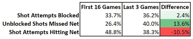
The table below compares all-situations production of Vegas’ top line during the first 16 playoff games, which includes Rounds 1-3 and Game 1 of the Cup Final, versus their production in the last 3 games.

We can clearly see that the group’s production has dropped off. While the trio was averaging well over one goal and three points per game through the first 16 games, they’ve managed only one goal and four points total in the last three games. Goals are low-frequency events by nature, though, so to properly evaluate their play in a sample as small as three games we need to look at the higher-frequency plays that lead to goals. The table below reflects even-strength play where Vegas’ 1st line is on the ice together.

A few numbers jump out from the above table. While the top line is generating significantly more shot attempts than previously, they are producing fewer shots on goal. This means that a higher proportion of the line’s shot attempts are being blocked, and those that aren’t being blocked are missing the net more often. Only 38.3% of the line’s shot attempts in the last three games are reaching the net, which is down more than 10% from the previous 16 games.
Elsewhere, the line’s event rates are down across the board. Per 60 minutes, Marchessault, Smith, and Karlsson are generating 4.86 fewer scoring chances, 1.19 fewer high danger chances, and 1.64 fewer goals than they did in the previous 16 games. Much of the reduced scoring can be explained by a decrease in the unit’s on-ice shooting percentage, but the line’s decreased scoring chance generation remains a worrying red flag.
Offensive production, or a lack thereof, does not exist in a vacuum. I would be remiss if I did not acknowledge the work that Matt Niskanen and Dmitry Orlov have done in neutralizing Vegas’ top line. This pairing has been heavily leaned upon to shut down Vegas’ stars, especially in Games 3 and 4 when Washington had last change as the home team. Using William Karlsson and Dmitry Orlov as proxies for Vegas’ 1st line (VGK L1) and Washington’s 1st pairing (WSH P1), we can see what proportion of VGK L1’s 5-on-5 minutes were played against WSH P1 in each game thus far.

Vegas’ lone victory came in the only game where their top line was able to play most of their even-strength minutes away from Washington’s top shutdown pairing. Since then, VGK L1 has seen a healthy dose of Orlov and Niskanen, and their production has suffered.
Whether attributable to a lack of execution or stellar opposing defense, the play of Vegas’ first line has been insufficient in their last three games. Their goal-scoring is down by more than half, fewer shot attempts are reaching Braden Holtby, and the line isn’t producing scoring chances at their usual rate.
For Vegas to begin climbing out of the hole they find themselves in, their top line will need to reverse these trends and find a way to produce. If they don’t manage to do so, the strike of midnight might be right around the corner.
All statistics courtesy of Natural Stat Trick (https://www.naturalstattrick.com/)
Cover photo credited to Daniel Clark
The Stanley Cup Formula: An investigation through machine learning /

NHL seasons follow a formulaic plotline.
Entering training camp, teams share a common goal: win the Stanley Cup. The gruelling 82-game regular season separates those with legitimate title hopes from those whose rosters are insufficient, leaving only the sixteen most eligible teams. The attrition of playoff hockey gradually whittles down this number until a single champion emerges victorious, battle-tested from the path they took to win hockey’s top prize. Two months off, then we do it all again.
Teams that have won the Stanley Cup share certain traits. Anecdotally, it’s been helpful to have a dominant 1st line centre akin to Sidney Crosby, Jonathan Toews or Anze Kopitar. Elite puck-moving defensemen don’t hurt either, nor does a hot goalie. Delving deeper, though, what do championship teams have in common?
I decided to answer this question systematically with the help of some machine learning.
Some background on classification
Classification is a popular branch of supervised machine learning where one attempts to create a model capable of making predictions on new data points. We do this by building up, or ‘training’, the model using historical data, explicitly telling the model whether each past data point achieved the target class that we’re trying to predict. In the context of hockey, this data point could be some number of team statistics produced by the 2015 Chicago Blackhawks. The target here would be whether they won the Stanley Cup, which they did.
Sufficiently robust classification models can identify a number of statistical trends that underpin the phenomenon that they’re observing. The models can then learn from these trends to make reasonably intelligent predictions on the outcome of future data points by comparing them to the data that the classifier has already seen.
Building a hockey classifier
We can apply these techniques to hockey. We have the tools to train a model to learn which team statistics are most predictive of playoff success. To do this, we must first decide which stats to include in our dataset. To create the most intelligent classifier, we decided to include as many meaningful team statistics as possible. Here’s what we came up with:

It’s worth noting that we engineered the ‘Div Avg Point’ feature by calculating the average number of points contained by all teams in a given team’s division. The remaining statistics were sourced from Corsica and Natural Stat Trick. An explanation of each of these stats can be found on the glossaries for the two websites.
Our dataset included 210 data points: 30 teams per season over the 7 seasons between 2010-11 and 2016-17. Each data point included team name, the above 53 team stats, and a binary variable to indicate whether the team in question won the Cup. Using this data, we trained nine different models to recognize the statistical commonalities between the 7 teams whose seasons ended with a Stanley Cup championship. The best-performing model was a Logistic Regression model trained on even-strength data, and so all further analysis was conducted using this model.
Results: Team stats that matter most to Stanley Cup winners
To evaluate which team stats were most strongly linked to winning a Cup, we created a z-score standardized version of our team data. We then calculated the estimated coefficients that our logistic regression model assigned to each team stat. The size of these coefficients indicates the relative importance of different team stats in predicting Stanley Cup champions. The 5-highest ranking team stats can be seen below:

Of all team statistics, ‘Goals For Per 60 Minutes’, or GF/60, is most predictive of winning a Stanley Cup. Of the 7 champions in the dataset, 4 ranked within the top 5 league-wide in GF/60 in their respective season, with 2016-17 Pittsburgh most notably leading the league in the statistic. Impressive results in ‘High Danger Chances For’ and ‘Team Wins’ both strongly correlate to playoff success, while ‘Scoring Chance For Percentage’ and ‘Shots on Goal For Percentage’ round out the top 5.
What does it mean?
Generating a list of commonalities among past champions allows us to comment on what factors impact a team’s likelihood of going all the way. Most apparent is the importance of offense. It is more important to generate goals and high-danger chances than it is to prevent them, as GA/60 and HDCA rank 36th and 13th among all statistics, respectively (their corollaries are 1st and 2nd). In the playoffs, the best team offense tends to trump the best team defense, which we saw anecdotally in last year’s Pittsburgh v Nashville Final. If you want to win a Stanley Cup, the best defense is a good offense.

We can see that a team’s ability to generate scoring chances, both high-danger and otherwise, is more predictive of playoff success than their ability to generate shots. Although hockey analytics pioneers championed the use of shot metrics as a proxy for puck possession, recent industry sentiment has shifted towards the belief that shot quality matters more than shot volume. The thinking here, which is supported by the above results, is that not all shots have an equal chance of beating a goalie, and so it is more important to generate a shot with a high chance of going in than it is to generate a shot of any kind. Between a team who can consistently out-chance opponents and a team who can consistently out-shoot opponents, the former is more likely to win a hockey game, and therefore playoff series.
Application: The 2017-18 season
A predictive model isn’t very helpful unless it can make predictions. So let’s make some predictions.
By feeding our model the team stats produced by the recently-completed 2017-18 regular season, we can output predictions of each team’s likelihood of winning the 2018 Stanley Cup. Since this is the fun part, let’s get right to the probability estimates for all 31 NHL teams:

The rankings above essentially indicate how similar each team’s season was to the regular season of teams that went on to win it all. In doing so, they hope to identify the teams most likely to replicate this success The model favours the Boston Bruins to win the 2018 Stanley Cup, predicting a victory over the Nashville Predators in the Final.
The above data highlights a few curiosities. Notably, we can see that some non-playoff teams had 5-on-5 numbers that were relatively comparable to past Cup champions. Specifically, the Blues, Stars, and Flames played 5-on-5 hockey well enough this season to qualify for the playoffs. The Blues and Flames can attribute their disappointingly long off-seasons to the 30th and 29th-ranked power plays, respectively. The Stars’ implosion is more of a statistical anomaly, and while conducting an autopsy would be interesting it would be better served as a subject for another article.
The lowest-ranked teams to have made the playoffs in the real world are the New Jersey Devils and the Washington Capitals. While their offensive star power might have been enough to get these squads to the dance, the model predicts a quick exit for them both.
A computer-generated bracket:

For fun, I’ve filled out the above bracket using the class probability rankings generated by our model. Of the 8 teams who have won or are winning their first-round playoff series, the model picked 7 of them as at the winner, with Philadelphia being the exception. While it’s far too early to comment on the model’s accuracy, as only a single playoff series has been completed, it’s an encouraging start.
Limitations of the analysis
The above results must be considered in the appropriate context. The model was trained and tested using only 5-on-5 data, which would explain the lack of love for teams with strong special teams like Pittsburgh and Toronto. The model is also blind to the NHL’s playoff format. Due to the NHL’s decision to have teams play against their divisional foes during the first two playoff rounds, teams in strong divisions have a much harder road to winning a Cup. Consider that Minnesota’s path to the conference final would likely involve Winnipeg and Nashville in the first two rounds, who finished 2nd and 1st in NHL standings in the regular season. Divisional difficulty is not reflected in the probabilities listed above, though incorporating divisional difficulty either probabilistically or through a strength of schedule modifier could be areas of further analysis.
A final limitation of the model is that it is trained using only 7 champions. In an ideal world, we would have access to dozens or hundreds of Stanley Cup positive instances, but due to the nature of the game there can only be one champion per year. We considered extending the dataset backwards past 2011 but ultimately decided against doing so. The NHL is different today than it was in the past. Training a model on a champion from 2000 tells us little about what it takes to have success in 2018. Using 2010-11 onwards represented a happy medium in the trade-off between data relevance and quantity.
What next?
Winning a Stanley Cup remains an inexact science. While it’s valuable to identify trends among past winners, there is no guarantee that what’s worked before will work again. It’s a game of educated guesses.
I believe that the most legitimate way to build a Stanley Cup winner is a combination of the past and the future. Analyzing historical data to identify team traits that are predictive of a championship is half the battle. The rest is anticipating what the future of the NHL will look like. The champions of the next few years will be lead by managers who are best able to identify what it’ll takes to win in the modern NHL. While the above framework approaches the first half in a systematic way, the latter remains much harder to crystallize.
In the meantime, let’s turn to what’s in front of our eyes. The playoffs have been tremendously entertaining thus far, and that’ll only pick up as teams are threatened by elimination. Let’s enjoy some playoff hockey. Let’s see which playing styles, tactics, and matchups seem to work. Let’s learn.
Even if your team gets eliminated, just remember that this season’s playoffs are just a couple months away from being data points to train next season’s model.
Then we do it all again.
Cover photo credited to Christopher Hanewincke — USA Today Sports
Playoff Preview: Toronto Maple Leafs vs. Boston Bruins /
Monday May 13, 2013:
The city of Toronto was electric. Competing in the Stanley Cup Playoffs for the first time in 12 seasons, the Toronto Maple Leafs inched their way to game 7 against the heavily favoured Boston Bruins. Continuing an improbable run led by Phil Kessel, Nazem Kadri, James Van Riemsdyk, Cody Franson, Dion Phaneuf, and James Reimer.
I was with a dozen of my closest friends, sitting at the head of the table in a Shoeless Joe’s party room. Every detail of that night is vivid in my mind -- for what was about to come can only be described as demoralizing. The Leafs held a 3 goal lead with less than 11 minutes to go in regulation time.
The lead evaporated. The Bruins’ eventual overtime winner became an inevitability.
Without a word, I immediately got up from my seat and stormed out of the bar. I glanced over at the patrons -- and to this day, I have never seen so many people simultaneously unsure how to react.
Present Day
Toronto is a dramatically different team. Now led by their sophomore phenom Auston Matthews, the Leafs look for revenge against the team that crushed the hopes of an entire fanbase five years ago.
Taking an analytics-focused view, let’s see how Toronto and Boston compare now.
Offensive Matchup


All data used is courtesy of Corsica and NaturalStatTrick
The Leafs are superior to the Bruins in every major offensive category. Toronto is one of the highest paced teams in the league, relying on their high-end offensive talent to best opponents. Boston had a similarly strong offensive season, but failed to generate a significant amount of high danger scoring chances per 60 minutes of play. This can likely be attributed to the Bruins' slower paced style of play.
Toronto Boston


The visuals above show the league rank of each forward in 5v5 primary points per 60 minutes. This metric is highly repeatable year over year, and gives a somewhat accurate depiction of a player’s offensive prowess. However, numbers are somewhat skewed by factors such as the quality of their linemates and the quality of competition faced.
The first thing that stands out about the Leafs’ chart is Auston Matthews. He ranks first league wide in 5v5 P1/60. Fans can expect him to be a constant threat, and the biggest ‘X-factor’ player in the series. Boston is led by what is likely the league’s most dominant first line. It is one of the only lines that is capable of dominating the overpowering combination of Auston Matthews and William Nylander.

Heat maps created and available on HockeyViz.com
Toronto is incredible at generating high danger scoring chances. This metric is much more predictive of goal scoring than stats such as ‘shots’. In contrast, Boston is far below league average at generating scoring chances right in front of the net, but remain a threat in the high slot. Toronto outperforms metrics such as Corsi for and scoring chances due to their admirable scoring talent, and high number of odd man rushes per game. Boston has slightly above average shot quality, meaning they likely score near their expected results according to Corsi and scoring chances.
Defensive Matchup


Boston
Zdeno Chara - Charlie McAvoy
Torey Krug - Kevan Miller
Matt Grzelcyk - Adam McQuaid
Toronto
Morgan Reilly - Ron Hainsey
Jake Gardiner - Nikita Zaitsev
Travis Dermott - Roman Polak
Boston has been an excellent defensive team this season, beating Toronto in every major defensive category. The Bruins are one of the best shot suppression teams in the NHL, forcing teams to shoot from unfavourable scoring positions. In contrast, the Leafs allow a high concentration of dangerous scoring chances from the slot, leading to a much worse defensive performance. Shots against location heat maps for each team can be seen below:

Heat maps created and available on HockeyViz.com
Toronto gives up a lot of high danger chances, leading to a higher expected goals against per game. It also means the team underperforms metrics such as corsi and scoring chances. Boston, in contrast, is excellent at shot suppression. This leads to outperforming metrics such as corsi and scoring chances, and results in a very low expected goals against per game.
Goaltending Matchup
Both the Leafs and Bruins boast top tier goaltenders with Frederik Andersen and Tuuka Rask. Using a goalie comparison tool created by Tyler Kelley (@DocKelley41), we are able to compare each goalie by key metrics:

Compare other goalies at: https://public.tableau.com/profile/tyler7457#!/vizhome/GoalieTool/2017-18ComparisonTool
For more on what each metric means, read here. The values on the x-axis of the graph are the percentile ranks that each of their stats fall on. Frederik Andersen is near the top of the charts with his Goals Saved Above Average. This is unsurprising considering the aforementioned shaky Leafs defense and the great play of Andersen so far this year. The stat highlights that if an average goalie were to be placed in the Leafs net in front of Andersen, they would be expected to concede a lot more goals. By this metric among others, it appears Andersen has a small edge over Tuuka Rask this season.
Prediction
The team statistics would suggest the Boston Bruins are the favourites in this series. However, in head-to-head matchups in the Toronto Maple Leafs have been the better team with a 7-1-0 record in 8 games over the past 2 seasons. This series should be a war, and one of the most likely first round matchups to go to 7 games. With that being said, my final prediction is Leafs in 7 games.
Keep up to date with the Queen's Sports Analytics Organization. Like us on Facebook. Follow us on Twitter. For any questions or if you want to get in contact with us, email qsao@clubs.queensuca, or send us a message on Facebook.
Playoff Preview: Winnipeg Jets vs. Minnesota Wild /
By Owen Kewell and Scott Schiffner
The calm before the storm.
The brackets have been setup, the matchup strategies developed, and the razors hidden away. For the first time since June, playoff hockey is here. We are mere hours from the puck drop that’ll kick off the 2017-18 Stanley Cup Playoffs, the starting pistol for a two-month long marathon where only one team can cross the finish line. In anticipation of this, we at the Queen’s Sports Analytics Organization decided to tee up the matchups featuring Canadian teams. We start with the Winnipeg Jets, who will play host to the Minnesota Wild on Wednesday night. The first round playoff series between the Central division rival Winnipeg Jets (2nd, 52-20-10) and the Minnesota Wild (3rd, 45-26-11) is an exciting matchup that is sure to feature a high level of speed, talent, and physicality from both sides. Both squads have enjoyed productive seasons, with the Jets posting the best record of any Canadian team, finishing with 114 points.
Offensive Matchup
Winnipeg enters the series with the reputation of having one of the most lethal forward groups in the league. Lead by a rejuvenated Blake Wheeler (91 points) and 44 goals from sophomore winger Patrik Laine, the Jets possess high-end offensive firepower that has torched the league for the better part of the season. Minnesota, meanwhile, enjoyed strong seasons from Eric Staal (76 points), Mikael Granlund (67 points) and Jason Zucker (64 points). Let’s take a quick look at some summary statistics from the regular season.

Stats from Corsica.hockey
The Jets scored 23 more goals than the Wild over the season, though much of this can be explained by their superior power play. Jets skaters had a higher shooting percentage, though the difference is too small to reasonably infer superior shooting ability. The Jets outperformed the Wild at generating shot attempts and scoring chances, though the Wild were able to create more high-danger scoring chances. While individual point totals suggest Winnipeg has more high-end forwards, we can examine depth charts to clarify the picture.

The graphic above shows the current depth charts (courtesy of Daily Faceoff) and each player’s rank among NHL forwards in even-strength primary points per 60 minutes. Here we confirm our belief that Winnipeg’s forward group is much deeper than Minnesota’s, as we can see that six Jets produced at a top-line rate compared to just three Wild players. To understand how the above results were achieved, we turn to heat maps.

Heat maps created and available on HockeyViz.com
The red areas indicate locations where a team shoots more frequently than league average, while blue is the inverse. In these maps we can see two teams who have a very different approach to generating offence. The Jets set up a triangle of attack, which results in a high volume of shots coming from the points and the mid-high slot. Being able to attack the slot with such regularity doubtlessly contributed to the success that the Jets experienced this season. The Wild, meanwhile, seem to play more on the perimeter with the goal of funneling pucks towards the crease. This explains why Minnesota produced more high-danger chances than the Jets despite generating less total scoring chances.
The offence matchup clearly favours Winnipeg. The Jets have the top-end firepower and the depth to roll scoring threats on every line. Throw in a dangerous power play, and the Jets are dangerous enough to make life miserable for anyone attempting to contain them.
Defensive Matchup
Winnipeg Jets:
Josh Morrissey – Jacob Trouba
Joe Morrow – Dustin Byfuglien
Ben Chiarot – Tyler Myers
Minnesota Wild:
Jonas Brodin – Matthew Dumba
Carson Soucy – Jared Spurgeon
Nick Seeler – Nate Prosser
The Winnipeg Jets allowed 216 goals in 2017/18, with 144 coming at even strength, while Minnesota allowed 229 goals (144 at 5v5). Winnipeg gave up an average of 31.9 shots per game, while Minnesota surrendered 31.3 on average. In terms of possession metrics, Winnipeg controlled 51.42% of shot attempts over the course of the 2017/18 season, good for 10th in the league, while Minnesota sits 29th with only 47.17% of shot attempts.
Comparing the top pairing defencemen for both teams using HERO charts:

http://ownthepuck.blogspot.ca/2017/05/hero-charts-player-evaluation-tool.html
The Minnesota Wild’s defence corps has taken a significant blow going into the postseason with the loss of number 1 defenseman Ryan Suter, who logged an average of 26:46 minutes of ice time per game before suffering a season-ending ankle injury on March 31. Veteran defender Jared Spurgeon remains a game-time decision due to an injured hamstring. The burden to cover these minutes will fall squarely on the shoulders of young defensemen Jonas Brodin and Matt Dumba, who will be counted on in key defensive situations. The Winnipeg Jets boast a tough lineup of physical defencemen, including Dustin Byfuglien and Tyler Myers, who will look to shut down the Wild’s top offensive lines. The Winnipeg Jets have the edge when it comes to top-tier defencemen, as well as much stronger depth on the blueline overall.
Finally, let’s compare the heat maps for both Winnipeg and Minnesota in their own defensive zones.

Heat maps created and available on HockeyViz.com
Taking a look at these maps, both teams are effectively limiting the number of scoring chances from high-danger scoring areas around the net (<25 feet) and in the slot. Minnesota’s heat map clearly indicates that the majority of chances are coming from the point (>40 feet out from the net) and down the right side, a potential weakness that Winnipeg’s quick wingers will look to exploit. Winnipeg’s defence is managing to limit almost all chances from high-scoring areas directly in front of their net, keeping the majority of shot attempts to the outside perimeter of the rink.
Goaltending Matchup:
We close our positional matchups by considering goaltending. Winnipeg will rely on Connor Hellebuyck, who broke out this year to post the winningest season ever by an American goalie. The young upstart will go toe to toe with Devan Dubnyk, the waiver-wire reclamation project that Minnesota has turned into a competent starter. Dubnyk has the qualitative advantage of playoff experience, but let’s see how the numbers stack up.

Unless otherwise specified, the above percentages reflect even-strength play. We see that Hellebuyck and Dubnyk performed similarly at even strength, as their save percentages for low, medium and high danger shots are all within a single percentage point. Where we see a difference, however, is on the special teams. While these stats are influenced by the quality of special team units, we see that Hellebuyck has significantly outperformed Dubnyk on both power plays and penalty kills. We also see that Hellebuyck saved about 2 goals more than expected given the quality of the shots being faced, whereas Dubnyk was over 7 goals in the hole on this metric.
If there had to be a choice between the two to start a Game 7, Connor Hellebuyck would be a safe choice. Despite his inexperience, his exceptional season played a huge role in Winnipeg’s ascension to 2nd place in the NHL’s overall standings. He’s shown to be better than Dubnyk at stopping the puck, and for that reason, he gives his team a better chance to win.
In summary, the numbers indicate that Winnipeg has the advantage in terms of offense, defense, and goaltending. The Jets enter the playoffs on an absolute tear, having won 11 of their last 12 games. They are 3-1-0 vs. the Wild in their season series. We are predicting that the Winnipeg Jets will be victorious in their first-round series against the Minnesota Wild, likely in 5 or 6 games.
How the Queen's Men's Hockey Team is using analytics - Interviewing Director of Analytics, Miles Hoaken /
By Anthony Turgelis (@AnthonyTurgelis)
If you've ever thought that sports analytics could only be implemented in national leagues, where there is plenty of data made publicly, then it's time to think again. Miles Hoaken is a first year Queen's University student in the Commerce program, that is the creator and director of the analytics department for the Queen's Men's Hockey team. In Miles' first year alongside the coaching staff, the team was able to break the school's record of most wins in a season (19) and finish second in the OUA Eastern conference. I sat down with Miles to talk about how he uses analytics to help make the team even better, and for tips on how other students can start getting into hockey analytics.
Thanks for coming today and agreeing to do this interview. I’m sure many students who support the Queen’s Men’s Hockey Team aren’t aware that there is an analytics department for the team, let alone that it’s run by a Queen’s student. Tell us a bit about who you are and what you do.
My name’s Miles Hoaken and I’m from Toronto. I started getting into hockey analytics when I was 13 years old. Basically, the Leafs lost game 7, blowing a 4-1 lead (as I’m sure a lot of you are aware), which made me realize that there might be another layer that myself and Leafs management weren’t paying attention to, and since they’re my childhood team I tend to follow them more. I started a blog when I was 13 years old, writing down some ideas that I had that were based on some hockey analytics, but not a lot since I was only 13 and I didn’t have the math background at the time to understand what some of the stats were. In 2014, the summer of analytics, I saw tons of people getting hired and realized it was realistic for analysts to get hired based on the work they produced on their blogs or Twitter, so I decided to get further into analytics, started writing more on my blog, and then in Grade 12 I got an analytics position with my high school team. I did statistical consulting on their play, mainly analyzing zone entries but varied depending on what the coach wanted from me on that day. From there, I parlayed that into my role with Queen’s, which is essentially running all their analytics and statistical operations. I basically serve as a coach on their coaching staff, so I’m right there in the office helping make decisions, advising the coach on certain strategy items, giving presentations to the players on occasion, and running that whole operation. We take a variety of stats, mainly pertaining to offensive output since that was the area coach was most interested in.
So you’re 18 years old and working with the coaches for the Varsity Hockey Team here at Queen’s for players who are often 3-5 years older than you. Cool to think about. How do you get the data that you use?
I get all the data live at the games, and it’s all tracked by hand. I print-out templates before the game that have everything that I’m going to fill out, for example, for an entry chart I’ll have categories to see who entered the zone, what type of entry it was (controlled or uncontrolled), what general location it was, and then some counting stats. To get the shot locations, I simply mark them down on a piece of paper and fill in the numbers in my spreadsheet after the game. This works well for us since we are trying to do them all live. I unfortunately don’t have the time luxury to go through all the games for many different stats and many different viewings, because I would probably fail all my school courses if I did. So it has to all be live, and has to all be fast, so the best way to do that right now is by hand. Next year, we have five other people helping me track stats, which should allow us to have more data to work with, but the long-term goal is to automate these parts of the job so that when I graduate, the analytics department could be run by one person at the click of a button.
Are you looking for more students to help out?
Right now we’ve filled all of our data-tracker positions for the upcoming year. We’re always looking for coders who can help out on some of the stuff on the presentation side since building a portal for the coaches is something that I’m trying to do. At my current level of coding I don’t think I could do it, but eventually with some help I think that we can get there. Keep watching our Facebook page, after next-year we’ll be looking for more data-trackers.
How has the coaching staff responded to your work with them?
The whole staff has been very receptive to analytics. Sometimes I come in with crazy ideas, but they really bear with me and take into account what I’m saying. Credit goes to Brett Gibson, when I walked into his office in the first meeting, I was a bit of an unknown and we were going to use an iPad app to track stats. I was able to convince him that the iPad app wasn’t that good and would be a waste of his money and the program’s money and that they should instead trust me and my templates. Maybe it takes a little bit of logic and a bit of crazy to trust an 18 year-old that he had never met before, but he put his faith in me and gave me this role and I will forever be grateful to him for that. He’s done a great job of incorporating me into the decisions and making sure my voice is heard. It’s something he didn’t have to do but I’m really glad he did. It’s been a great situation with the coaches, and coach Gibson has brought the program from a point where we only had 4 former CHLers when he started, to 21 CHLers now so that speaks to his work ethic and commitment to the program for sure.
What’s your relationship like with the players? Do you think they’ve bought in to your recommendations?
I’ve presented to them once so far. It was interesting to read the room because it seemed like the people at the top of the list for the stats I was presenting had a quicker buy-in to what I was talking about. The players at the bottom of the list seemed to look a little bit more confused by it, but what I found that the players near the bottom of the list actually had a larger increase in these stats than those near the top of the list, which made me think they were responding well to it. They also get access to my reports after every game.
Do you do any coding as part of what you do?
I would say that half of my job is in the rink doing the tracking and recommendations, and the other half is during the week, coding and making programs. The report I give to the coach after every game contains some offensive statistics which are all generated by graphs on the program R. I set it up so that I can simply change the game number and it will generate the code for that game. It’s a big part of what I do, if anyone is looking to get into hockey analytics, I would say the first thing to learn is coding because it will just make everything a lot easier. I also use coding to generate statistics on the league. I have a web scraper that takes the raw data from the U-Sports website and then turns it into ‘fancy stats’ – Goals for %, Shots for %, some I’m even able to get for 5v5 play through the data that they give us. So coding is a big part of it, I use R, personally but there is a big debate in the hockey analytics community between R and Python – you really can’t go wrong with either. I’m learning Python as part of a coding course at Queen’s next year (CISC121), but R is what I started with and the one I feel the most comfortable with.
This year you spoke about what you do for the Queen's Men's Hockey Team at VANHAC (Vancouver Hockey Analytics Conference). The presentation link is here. Tell us about your experience at VANHAC. Would you recommend it for those who are interested in working or learning about hockey analytics?
VANHAC was a really great experience for me. I went as a high school student, it was sort of like my grad trip. Some people go on S-Trip, I went to a hockey analytics conference which I think tells you all you need to know about my personality and my passion for this. *laughs* VANHAC is really awesome, it’s probably the best conference in North America, in terms of your value and hockey analytics specifically. Sloan (MIT) is the big one for sports analytics in general which I hope to go to someday. Really though, if you want to meet people from NHL teams, see some of the best research that’s come out recently, you have to go to VANHAC. It’s great because you don’t necessarily need to be an expert to go, some people were there with no experience whatsoever, didn’t know what Corsi was and ended up really enjoying it so it’s a really fun environment. The hockey analytics community is one of the most welcoming communities ever. When I was presenting there this year I didn’t feel nervous at all, so I definitely recommend it to any hockey analytics fan or even someone just trying to get into it.
Do you think we’ll ever see analytics at the forefront of U-Sports hockey? I feel like if more students knew that what you do is possible, there might be more focus towards it leading to each team having their own student-led analytics department.
At VANHAC, Brad Mills (@MillsBradley11) who’s the COO of Hockey Data (@HockeyDataInc), he approached me after my presentation and since he played in the NHL, we started talking about how the game is changing from the advances of analytics since he played. He said that given the amount of teams in U-Sports, and given all the statistics I was using, it would cost ~$11,000 to do what I do for every single team in the regular season. I was surprised at how little it was, but at the same time, I mentioned “That $11,000 is only worth it if we have all the data and nobody else does” since that’s what gives us our competitive advantage. That was actually one of the questions I received after my presentations which was “Do you do any analysis on players from other teams” and the answer to that is no, because the public information I can get is points, and I have no idea where these points are coming from necessarily, or if their skilled in any other way that a micro-stat could capture but I don’t have access to it. There are definitely people like me at other Universities, maybe not to the same extent or scale since we’re becoming one of the more advanced ones, especially given the amount of trackers we’ll have next year. I know Western and UOttawa have an analytics person as well but some teams don’t even have that voice in the room, and with that sometimes you can get into groupthink.
You’re active on Twitter (@SmoakinHoaken). How has Twitter been a learning tool for you?
Twitter has been huge for me, I got Twitter when I was 13, which you can probably tell from my handle (@SmoakinHoaken) (Hannah Montana reference). It’s been really key, people post their research on Twitter first, and people have gotten hired not because of Twitter, but because of the work they’ve put out on Twitter. It’s great for questions too, if you’re new to hockey analytics, you can use the hashtag #HockeyHelper and Alex Novet or someone from @HockeyGraphs will reply to you really fast with some advice.
Aside from @QSAOqueens, what are 5 Twitter accounts that you recommend hockey analytics enthusiasts to follow?
@IneffectiveMath – Micah Blake McCurdy (www.hockeyviz.com) – I got to meet him at VANHAC and he posts a lot of cool visuals and has a patreon with premium content which allows him to make even more graphs. His theme is that numbers are tired, and pictures are wired, which I really like. We’re actually trying to incorporate more pictures and visuals with Queen’s next year.
@AlexNovet and @HockeyGraphs, who post Hockey Graphs’ new articles on Twitter.
@SteveBurtch – I think he said he tweets a thousand times a month or something like that, so you get a lot of content that’s interesting. As he’s joked about himself, he has a surprisingly low “Bad-takes/60 tweets”, so you should definitely follow him.
@nnstats - Superbowl champion, someone I really look up to for advice on coding and life etc. She will be the first female GM for sure.
@MannyElk – If you’re looking for hockey twitter, but also salads and interesting takes on pop culture, you should definitely follow Manny.
Manny is certainly a fun follow, and the others are great as well. How would you recommend hockey enthusiasts to learn more about the analytics behind the game, aside from reading all of the great content on www.qsao-queens.com and attending QSAO events?
I’d say read a lot. That’s what I did throughout my highschool years, I would just read and read and read until I finally felt comfortable presenting these ideas to a coach to volunteer. If you’re not comfortable learning coding just yet, learn everything you can about Excel or other data visualization software. Also learn to effectively communicate your ideas. I know that if I present my idea to the coaching staff as a bunch of numbers, they will not care. If I explain how the idea could be implemented and show them that it works in some setting, then it’s way more likely to be accepted. I think that’s a big problem with some analysts, they can be a little cantankerous or have a high and mighty attitude at times where it’s ‘them-vs-the-world,’ but that mentality won’t serve them well in life. So it’s really important to communicate these ideas effectively, in my opinion.
All the VANHAC talks are on Youtube (link to the playlist here) so watching all of those would be great. If you’re still in high school, or even University, find a way to work with them in any capacity. I started by running a Twitter account in Grade 11 for the Don Mills Flyers. From there, I met plenty of interesting people in the industry that I still keep in contact with. This gig helped me work for my high school team, which ended up being analytics.
Thanks for doing this Miles, looking forward to working with you in the future to help make the Queen's Men's Hockey Team even better.
Keep up to date with the Queen's Sports Analytics Organization. Like us on Facebook. Follow us on Twitter. For any questions or if you want to get in contact with us, email qsao@clubs.queensuca, or send us a message on Facebook.
Using pitch values to preview the Blue Jays' 2018 starting pitchers /
By: Anthony Turgelis (@AnthonyTurgelis) and Jordan Moore
Data Visualizations by: Adam Sigesmund (@Ziggy_14)
All data from Fangraphs, all projection values from ZiPS.
Baseball is back! Tomorrow afternoon, the Toronto Blue Jays will take on the New York Yankees to open their 2018 season. While there are certainly reasons to be optimistic and pessimistic about this Toronto Blue Jays team, their starting rotation remains to be seen as a strength. This article will first introduce Fangraph’s Pitch Value system and how they evaluate pitch effectiveness, and later preview the Blue Jays starting rotation so it can be seen what every pitcher has to offer.
Fangraphs Pitch Value System
The idea behind the Fangraphs Pitch Value System is to assign run values to how a pitcher performed while using this pitch. They are then compared to the average results, to determine whether each pitch value is below or above average, and by how much. These can also be viewed for hitters, who generate similar calculations based on how effective they are against each type of pitch. For this article, we will use the standardized calculations which are calculated on a ‘per 100 pitch basis’, since each pitcher’s pitch frequency widely varies, but to provide this further context we will also include their pitch mix from the current year.
The limitations of Pitch Values are that they are not always predictive, and can vary from year-to-year. Also, there is likely to be some variance depending on which batters the pitcher had to go up against, since the batter’s ability to hit each pitch will affect the results. If a pitcher were to happen to face batter’s who are less-skilled or less-prone to hitting a curveball (for example), a curveball-heavy pitcher may post higher curveball values due to this lucky arrangement, which may not be entirely indicative of their curveball results going forward. To offset this, their career pitch values will also be included, so if there did happen to be a year where a certain pitch performed wildly different (which again, could be from external factors), their career numbers could also be used to predict their value going forward. In addition, Pitch Values are only calculated for: fastballs (wFB/C), curveballs (wCB/C), changeups (wCH/C), cutters (wCT/C), sliders (wSL/C), knuckleballs (wKN/C), and splitters (wSF/C). Sinkers are included in fastball calculation.
The 2017 best and worst values will also be highlighted for reference on how effective each pitch is to the worst and best values that qualified (large enough sample) starting pitchers have produced. Values here were omitted if the pitch was less used in less than 15% of their pitches thrown, which could create small sample size noise and overstate its value. Using this statistic, let’s see where the Blue Jays Starters stack up against the rest of the league.
J.A. Happ - Opening Day Starter


We begin with the Opening Day starter, J.A. Happ. Happ is a curious case as his career numbers probably don’t reflect his true ability at this point in his career - in a good way. After being traded from the Blue Jays to the Seattle Mariners, the Mariners later flipped Happ to the Pirates at the deadline. Here, Happ linked up with pitching coach Ray Searage, who has notoriously shaped-up the careers of many pitchers. Things clicked for Happ who turned a curveball that was arguably his weakest pitch, to one that achieved very good results, possibly because of its reduced usage.
His career pitch value on his curveball sits at -0.97 - below average - but in the last two seasons has achieved a curveball value of 1.53 and 1.41, above average and ranking him 18th among pitchers who pitched 100 innings of more last season. As seen in the graph, Happ had an above average fastball last year and throughout his career, a not-so-great slider and a not-so-great changeup. The thing to remember here is that these values are rate stats, so the fastball grading out positive is the most important part since it’s a pitch he throws ~70% of the time. Happ had an fWAR of 2.9 last season (38th among pitchers with 100+ IP), and is projected to put up an fWAR of 2.7 this upcoming season. The often-underappreciated Happ should continue to be one of the Jays most consistent pitchers.
Aaron Sanchez - Friday's Probable Pitcher
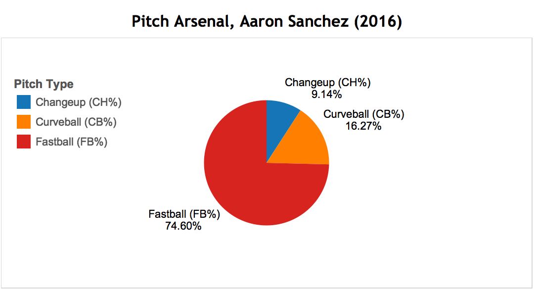

Aaron Sanchez, the 6’4 25 year-old California native is looking to stay healthy and pick up where he left off in the 2016 season. 2017 was a very disappointing season for Sanchez as a blister on his throwing hand kept him sidelined for all but 8 games in the season. In 2016, Sanchez held a 15-2 record with an ERA of 3.00 which was good enough to earn him his first All-Star game nod (replacing injured Craig Kimbrel). Considering Sanchez's small 2017 sample, his 2016 and career numbers will be used for comparison purposes.
In 2016, Sanchez held a fastball value average of 0.94, leading him to throw a fastball 74.60% of the time. What makes Sanchez’s fastball so unique is the ball tends to move like a breaking ball, however it still packs extreme heat causing his fastball to produce great results. Sanchez’s fastball value improved in 2016 compared to his career average of 0.86, so there is lots of optimism the young stud can continue this positive trend if he stays healthy. Sanchez's high value and high usage means that he sits down a lot of batters on his fastball, and it is a top pitch.
In 2016, Sanchez also saw an increase in his curveball value raising to 0.68 compared to his career average of 0.11, so we may see more of a curveball added to his arsenal in 2018 (threw a curveball 16.27% in 2016). Sanchez saw a small increase in his change-up value in 2016 compared to his career average (0.27 to 0.7), so hopefully he can continue to develop his change-up as well. With one all-star game under his belt already, and his fastball, curveball, and change-up all improving in 2016 compared to his career average, Sanchez has a very bright future as he approaches his prime.
If Sanchez can continue to improve in all 3 of his pitches, he has the potential to be a CY Young candidate. In 2016, he produced an fWAR of 3.8, but ZiPS is projecting him at 2.3 fWAR for the coming season. If he can stay healthy, he has a chance to be significantly higher than that, if not the Jays might be in trouble. Injuries seem to be the only thing stopping Sanchez at this point in his career, so he and the Blue Jays will be hoping he stays on the field as much as possible.
Marco Estrada - Saturday's Probable Pitcher


Coming into his fourth season with the Toronto Blue Jays, seasoned veteran Marco Estrada is looking to bounce back from a year where he saw all 4 of his pitches drop below his career averages in value. The 34 year old has been known as a location pitcher throughout his career, putting the baseball in the corners of the strike zone forcing the batter to make difficult decisions on whether to swing or not.
Throughout Estrada’s career, he has evolved into a change-up specialist, however his change-up value fell off a cliff in the 2017 season, dropping below the league average to a weak score of -0.7. This may indicate batters have solved the puzzle of his change-up pitch, or it could indicate age is taking a toll on Estrada’s performance (he will be 35 in July). With a seasoned pitcher like Estrada however, there is always room for optimism as he could rebound in the 2018 season and bring his change-up value closer to his career average where his change-up value sits at 0.63, above the league average. Estrada’s fastball saw an insignificant value drop of 0.05 compared to his career fastball value of 0.28, indicating his arm strength is still healthy while he’s approaching age 35. Estrada saw the biggest drop in his curveball, dropping to a disappointing -1.57 in value, which may explain the low percentage of this pitch choice in 2017 (7.70%). Estrada’s cutter has always been very below average, and he saw this pitch drop in value as well to -1.63 while only throwing a cutter 6.70% of the time. The low percentages of curveball and cutters thrown in the 2017 season indicate he’ll rely heavily on his fastball and change-up again in 2018, so hopefully Estrada can rebound this season and find his change-up groove again.
Even in a down year, Estrada managed an fWAR of 2.6 in 2016, and is projected for 2.1 fWAR this coming season. Estrada was a guy who had outperformed his FIP in each of the three previous seasons before last, and will likely need to find out how to do that again this coming season, and figure out how to surpress contact like he used to.
Marcus Stroman - Sunday's Probable Starter


The would-be Opening Day starter had he not picked up a minor injury in Spring Training, many look to Marcus Stroman as the face of this ball club. Standing at 5' 8", Stroman is proof that Height Doesn't Measure Heart, and that if you can throw a baseball, you do not need to tower over the competition to be a starting pitcher.
Stroman leans heavily on his fastball and his slider, which is a good call considering those are his two best pitches. His slider pitch value is consistently above league average at 1.46 last year and 1.22 throughout his career. He had the 10th highest pitch value out of all qualified starters last year. The movement on this pitch can sometimes be just insane, which is seen in the video below:
Nasty, even though it missed the zone. His fastball grades out as above average as well, which is very valuable given the high usage. His tertiary pitches don't grade out as well, with his cutter and curveball getting near-average pitch values throughout his career. His 2017 cutter value was left in the graph to illustrate how a small sample size can affect this stat. His usage was only 2.4% last year, and a few unlucky results could really sway the pitch value stat. This shouldn't be a reason for concern.
Stroman had an fWAR of 3.4 last year, and ZiPS expects him to take another step forward this season projecting an fWAR of 4.5 this season. Expect him to battle with Aaron Sanchez this year to be regarded as the team's Ace.
Jaime Garcia - Monday's Probable Starter


The only new addition to the list, Jaime Garcia called St. Louis home for 8 years where he won the world series in 2011, until he fell victim to the trading carousel of the MLB. He was traded to the Atlanta Braves on December 1 of 2016, where he recorded a 4-7 record with the Braves before being traded to the Minnesota Twins on July 24 in 2017. Less than a week later, Garcia was traded to the New York Yankees. On February 15, 2018, Garcia signed a 1 year deal (with a team option for a 2nd) with the Toronto Blue Jays where he is hoping to again find his groove and play his way into a multi-year contract. He has a standard 4-pitch mix with no pitch extremely more or less dominant than the rest
In 2017, Garcia’s fastball had a value of 0.28. He threw a fastball 60.36% of the time in 2017, and considering it's above average results, is a good weapon for him. Garcia’s curveball took a statistical dive in 2017 as he had a career curveball 0.03, and in 2017 this value dropped to a dismal -1.87, putting it in the lowest tier of value for qualified starters. In 2017 he only threw a curveball 6.74% of the time, which means that the negative results didn't hurt him overly often. We shouldn’t expect to see Garcia throw a lot of curveballs this year unless he can get better results with it. Garcia’s slider value in 2017 was right on par with his career slider value at -0.79, so we may see some reduced usage, but this pitch does seem to be one of his weaker ones. Garcia also saw a small improvement in his change-up last year, bringing his value up to 0.24 compared with his career change-up value of 0.11. Perhaps Estrada and Garcia can work together to improve one another’s change-up as Estrada is considered a change-up specialist who had a terrible year last year.
Garcia put up an fWAR of 2.1 last season across his 3 teams. ZiPS projects him to put up an fWAR of 1.6 this season, which is perfectly acceptable for a 5th starter. If Garcia can get into a groove and continue to get good results on his fastball and change-up values, he will fit well into the Blue-Jays pitching rotation and he can be a valuable asset to the team for his pitching, leadership skills, and World Series experience. If not, it's a one-year deal that won't hurt in the long-run, which makes it a good signing considering where the Jays are at in this point of time.
Happy Opening Day everyone, we hope you'll follow along with QSAO as the season progresses for more Jays and MLB analysis. Catch the Blue Jays Opening game against the New York Yankees on March 29th at 3:37pm on Sportsnet Ontario.
Keep up to date with the Queen's Sports Analytics Organization. Like us on Facebook. Follow us on Twitter. For any questions or if you want to get in contact with us, email qsao@clubs.queensuca, or send us a message on Facebook.
NHL Player Comparison Tool Guide /
By Owen Kewell and Adam Sigesmund (@Ziggy_14)
Player comparison is a popular topic of debate among armchair general managers: which guy is better? Would you rather have Player A or Player B? In the wake of a big 1:1 trade, which team won? While in the past we were left to bias, favouritism, and the infamous eye test, today we have some visualization tools to help compare players across useful metrics.
HERO Chart:
One of the best and most intuitive of these tools is the HERO Chart, as pioneered by Domenic Galamini Jr. (@MimicoHero). These charts, which are within the realm of descriptive statistics, can be found at the following website: http://ownthepuck.blogspot.ca/
Below we can see Alex Ovechkin’s HERO Chart:

What Stats Are Measured?
HERO charts show performance across five stats: ICETIME, GOALS, FIRSTA, SHOTGEN, and SHOTSUP. ICETIME refers to all-situation (even strength, power-play, or short-handed) minutes per game. GOALS measures 5-on-5 goals per 60 minutes, while FIRSTA measures 5-on-5 first assists per 60 minutes. SHOTGEN is 5-on-5 shots generated per 60 minutes and SHOTSUP is 5-on-5 shots suppressed per 60 minutes, both relative to average. These stats are measured across the most recent three seasons, with weightings of 44%-33%-22% respectively to ultimately reach a single measure.
It’s important to note some key features of these metrics. Aside from ICETIME, the other four stats are measured only at even-strength and per 60 minutes of playing time. This serves to level the playing field, and accounts for the situation and frequency with which different players are deployed. Making these adjustments gives us a better sense of a player’s true performance, though we must consider HERO chart results in an appropriate context. Logging massive minutes and special teams scoring remain hugely important parts of the game, so they should not be disregarded when evaluating a player’s usefulness even if they are not reflected in a player’s HERO chart.
What Do the Numbers Mean?
Each of the numbers you see represents a standardized rating from 0 to 10. A rating of 5 represents league average performance at a skater’s position, with a standard deviation of 2 in either direction. For example, as we can see, Alex Ovechkin is league average at first assists compared to eligible wingers. A rating above 5 shows performance above league average, and vice versa. The scores are normally distributed with a standard deviation of 2. We can see that Ovechkin is considerably above league average at generating shots, and somewhat below league average at suppressing shots.
Can I See Someone’s Stats Over Time?
Yes you can! Just under the HERO chart you’ll find a chart showing how the player has performed over recent years. The dark blue line represents primary points per hour, and the light blue line represents shot impact per hour. Here is Ovechkin’s. We can see a slow decline, though Ovechkin remains a strong performer in both metrics.

How Do I Compare Players Directly?
HERO charts were largely built to perform direct comparison, so when you enter Domenic’s website you’ll see two charts beside each other. You can select players of your choice from the dropdown menu for either chart and see a direct comparison. Let’s compare two elite centres: Sidney Crosby and Connor McDavid.
Scanning the charts, we can see that Crosby ranks higher in goals and shot generation, while McDavid ranks higher in first assists and shot suppression. Both players are fantastic across the board.

What Else Can I Do?
In addition to comparing players to other players, we can compare players to positional archetypes. For example, we could see how Max Pacioretty stacks up compared to the average first-line winger, or how Morgan Rielly performs relative to an average #1 defenceman. Below we can see Pacioretty’s chart:

If you’re interested in learning more about how the archetypes are calculated, there’s a section labelled ‘Chart Guide’ on the website containing an explanation of the methodology. Personally, I (Owen) enjoy using archetype comparisons to evaluate acquisitions that my favourite team makes, as it gives a high-level indication of where a player could fit into a lineup. It’s also useful for convincing your friends that the young guy you’re bullish on has legitimate upside, and that your team is going to go all the way because of it.
I Have Unanswered Questions - Where Do I Go?
That’s a quick and dirty explanation of what HERO charts are and how to use them. If you have any burning questions that are unaddressed, I encourage you to read through the HERO chart FAQ’s that Domenic published. The link can be found here: https://ownthepuck.wordpress.com/2017/01/21/hero-charts-frequently-asked-questions/.
All-3-Zone Player Comparison Tools:
Eric Tulsky once said "the magic of analytics is in recording all of the small things lost to memory that add up to something significant.” The easiest events to remember after you watch a hockey game are the big events: the goals, and sometimes even the shots. What you probably don’t remember, though, are the small plays that led up to those events, and the small plays that led to nothing at all. Tulsky worked with people like Corey Sznajder (@Shutdownline) to study the events in the neutral zone that drive offense. Although Tulsky now works for the Hurricanes, Sznajder runs a massive tracking project whose numbers are brought to life by CJ Turtoro's (@CJTDevil) All-3-Zones Player Comparison Tools. Before we learn about these tools, it is important to note that Sznajder literally watches every game to collect these stats, as opposed to the data from HERO charts which are released by the league and then displayed as you saw earlier. The sample sizes in these visuals are smaller as a result, but we will see in a moment how they capture some important ways that players create value for their teams.
There are two sets of visuals, which can be found at the links below:
First, we will discuss the set of visuals you can find by clicking that first link above. Below, you will see a screenshot of one of the four visuals available at that link:

The stats displayed on this page quantify what happens when a player tries to enter the offensive zone with the puck. He can either carry it in (carry-ins/60), dump it into the zone and then chase after it (dump-ins/60), pass it off to a teammate (Entry passes/60) or fail in his attempt (fails/60).
We care about these numbers because entering the offensive zone with control of the puck is a reliable way to create offense. It is one way to quantify a small thing lost to memory that gives rise to something significant. As you can probably see from the leaderboard above, players who succeed at entering with control are better at creating offence than those who struggle to bypass opposing defenders. This is why the players here are sorted by possession entries (carry-ins + entry passes per 60 minutes).
While tracking carry-ins is a way to quantify the creation of offence, we can also use these numbers to quantify defence. Whenever a player tries to carry the puck into the offensive zone, the opposing defenders want to stop them. The best defenders in these metrics allow the fewest possession entries. The worst ones allow attackers to create offence with ease. It should not surprise you, then, that attackers try to target the defenders who struggle to defend the blue line. Defenders who allow possession entries 90% of the time they are targeted by opposing teams are obviously quite poor at defending the blue line. Below, you will see which defenders allow the fewest possession entries as a percentage of the number of times they were targeted:

Some of the best defenders in the league show up in this leaderboard, which is further validation that what we are studying is actually important. It is always a good sign when the numbers are validated by the eye test and by years of research.
The best defensive teams either prevent zone entries altogether, or they remove the puck from the defensive zone as soon as possible. Indeed, zone exits are another way to measure defensive contributions in hockey, for both forwards and defensemen. The screenshot below shows which players succeed at removing the puck from their zone:

Again, positive contributions are measured by Possession Exits/60. Exiting with possession of the puck occurs when a player carries the puck out of the defensive zone (carries/60), or when they make a successful pass to a teammate (Exit passes/60). If a player fails to exit the zone with the puck, it is obviously a failed attempted (Fails/60). If he dumps it, clears it, or ices the puck, he is merely giving the other team another chance to create offence, which is why Possession Exits/60 ignores Dumps/60, Clears/60, and Icings/60. Exiting the defending zone with possession of the puck is obviously better than not.
So far, we have learned how to quantify the ways players transition from the defensive zone to the neutral zone, and then into the offensive zone. All of these numbers have one underlying theme: Puck possession leads to shots. But how do we measure which players create the most shots? While the obvious answer is to count the number of shots a player takes, the tracking project takes this one step further, and counts up to three passes before each shot is taken. In the same way that points are counted as goals and assists at the player level, the tracking project keeps track of shots and the passes that precede them. The visual below illustrates how each player contributes to shots by shooting or passing:
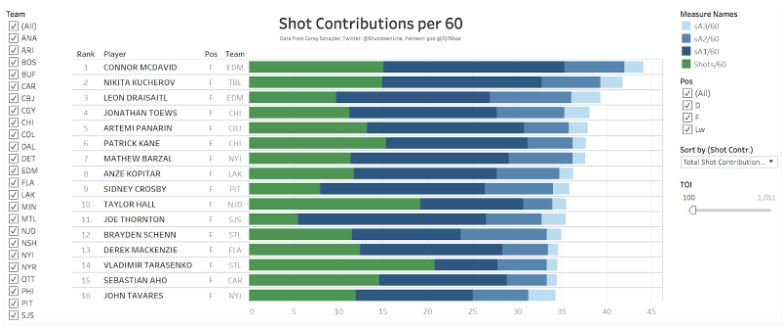
This leaderboard ranks players by their Total Shot Contributions per 60 minutes. A player contributes to a shot if he is the shooter (Shots/60), or if he made at least one of three passes before the shot was taken. Assisting on a shot is the same as assisting on a goal, except Shot Contributions consider up to three passes before a shot while points only consider two passes. If a player made a pass immediately before the shot was taken it is called a Primary Shot Assist (sA1/60), if he made the second pass before the shot it is a Secondary Shot Assist (sA2/60), and if he made the third pass it is a Tertiary Shot Assist (sA3/60). Altogether, shot contributions are an excellent and reliable way to measure which players are creating offence.
Now that we have explored this first set of 4 visualizations, we can move on to the second part: The Player Comparison Tool. As you will see below, the Player Comparison Tool presents the numbers in a way that summarizes all of the stats we have learned about from the leaderboards. Take a look:

Most of the stats seen here should seem familiar, but this time they are aggregated to provide you with a more general snapshot of each player. For example, the Shot Contributions leaderboard we saw earlier broke down Shot Contributions into four stats: shots, primary shot assists, secondary shot assists, and tertiary shot assists. The Player Comparison Tool, summarizes these numbers to measure shooting (Shots60), passing (ShotAssists60; sA1/60 + sA2/60 + sA3/60), and total contributions (ShotContr60; Shots60 + ShotAssists60).
The zone entry leaderboard is summarized in the Entry section, using possession entries expressed as a rate stat (PossEntries60) and possession entries expressed as a percentage of total entry attempts (PossEntry%). Similarly, the zone exit leaderboard is summarized in the Exit section.
It is important to note that if you are viewing a forward using this tool, you will only see the first three sections. The fourth section, Entry Defence, is only available for defenders. This section summarizes the aforementioned Entry Defence per Target leaderboard. As discussed earlier, the best way to defend the blueline is to prevent attackers from entering the zone with control of the puck. A defender who breaks up a play at the blue line is credited with breaking up the play (Breakups60). Defenders who concede controlled zone entries less often are the ones who rank best in the second stat (PossEntriesAllowed60). This is also expressed as a percentage of the number of times the defender is the target of an attempted zone entry by the other team (PossEntry% Allowed).
You can view a players results in two 1-year windows and one 2-year window, covering the 2016-17 season and the 2017-18 season. This allows you to compare one player to himself (in consecutive seasons) or two players to each other (in the same single season or across both seasons simultaneously). As shown in the intro to analytics article, an example that motivates the study of the former is Nikita Zaitsev’s first two NHL seasons. If you are feeling extra fancy, you can also view two different players with the same name...

Although the most valid comparisons are those between players of the same position, which is obviously not true of the Sebastian Aho’s, it demonstrates one of the many ways you can be creative with these visuals once you start using them. With these tools at your disposal, you can answer silly questions like “Is Sebastian Aho better than Sebastian Aho?” along with more objective ones such as “Who contributes to offence the most often?” and “Which defenders are best at defending the blueline?” It would be impossible to answer any of these questions without the hard work of people like Sznajder, Turtoro, Tulsky, and the mission to record mundane elements of the game that uncover hidden areas of player value.
Keep up to date with the Queen's Sports Analytics Organization. Like us on Facebook. Follow us on Twitter. For any questions or if you want to get in contact with us, email qsao@clubs.queensuca, or send us a message on Facebook.
An xGuide to Soccer Analytics /

By Anthony Turgelis (@Anthony Turgelis) and Erik Kiudorf
The State of Soccer Analytics
Relative to other major sports, soccer lags behind with regards to its acceptance of analytics within the game. Soccer is an extremely traditional sport that is usually reluctant to change, so this should not come as a huge surprise. While there are some that are ignoring, there are some that are using this as a competitive advantage - and it’s really working in some cases.
In a game as fluid as soccer, it is difficult to understand the game objectively amidst differing opinions from players, fans, coaching staff and the media alike. However, the recent growth of analytics in soccer provides an element of objectivity. It introduces new measures of predictability that encourage analysis, in an area where it is currently lacking.
Another reason that soccer analytics lags behind to the public eye, is due to the rarity and inaccessibility of the data. Not to mention the complexity and quantity of data required to fully capture value on an open-play sport with infinite game outcomes. The company that holds the monopoly on advanced soccer data is called Opta, and they track every game in every major soccer league around the world. Since there are a lot of games to cover worldwide, lots of things to track, and only a few groups doing it, it’s not hard to see why this data is easy to monopolize. As a result, this data is either difficult to scrape from the web, or too expensive for personal use as it is believed to be priced in the four digit range per year for a license for a single league’s worth of data, but obviously this varies by use and is not confirmed by Opta themselves. As a result, it is difficult, but not impossible, to practice public soccer data analysis.
There are still other ways though! Sites like WhoScored and Squawka offer simple game stats for teams and players, although they are not exportable with traditional methods. For MLS specifically, American Soccer Analysis offers many features to get your fix for advanced stats, which will be highlighted throughout the article. These concepts can be used as evaluation tools, to confirm the eye-test, or to just enhance the viewing experience of the game.
How Teams are Using Analytics
Although statistical analysis is not new to soccer - where pass counts, pass completions and shots taken, for example, are often recorded - such stats only provide information of certain events in the game, while lacking further insight. Soccer analytics helps identify and acquire insight regarding potential players’ performances based on previous data sources collected from past performances. These advancements enable coaches and managers to utilize this data to plan more effective training programs, team selections, and game strategies.
Analytics can be broken down into technical and physical categories. The physical aspects account for distance covered, intensity, number of accelerations and decelerations and jumps and lands. This data is most often utilized to monitor individual training loads which helps minimize injuries. The Seattle Sounders of Major League Soccer mainly focus on sports science along with physical analytics to ensure players are at their physical peaks and to prevent injuries
However, technical analytics act as a tool to help players and coaches to quantitatively assess individual and based team performances. This information is used to improve both individual and team performances and design successful strategies for upcoming games. These mechanisms can also provide knowledge to predict outcomes of games, create new game strategies, determine the price value of a player and connect players to brands and sponsorship opportunities. Devin Pleuler, Senior Manager of Analytics at Toronto Football Club, explains the importance of analytics in Major League Soccer “The players are on a salary cap but the analytics department is not so it’s a way you can set yourselves apart in a relatively cheap manner”. Analytics helps us quantify individual in-game events to provide an understanding of the probability of success, often evaluated by estimating goal scoring potential. It assigns values to the events - events being each stat category - to help better understand and coordinate tactics and systems. Coaches and managers can use this data to tailor tactical systems for upcoming games that are backed by objective information, translating to higher success rates on the field.
It's no surprise then, that in a game where analytics is finally starting to carve out a place for itself, that the two using it the most heavily in the MLS, have ended up in back-to-back MLS Cup finals against each other. Fun tidbit, when these two teams first competed in the MLS Cup finals, TFC's Senior Manager of Analytics challenged the Sounders' Director of Analytics, Ravi Ramineni, to a friendly wager:
No word on whether Devin actually gave up his calculator or not, as TFC did end up losing that round. If he did, perhaps he got it back the next year when TFC was victorious over the Sounders.
Expected Goals (xG)
The most popular and most cited advanced metric in soccer analytics is Expected Goals (xG). Generally, expected goals is the count of how many goals a player should have been expected to score on, based on the quality of their chances. There are many models attempting to capture this, some better than others, but none are perfect. The main two inputs that can be found in most, if not all xG models, is where the shot took place, and how the shot was taken.
The ‘where’ of the shot refers to both the distance and angle of the shot. Logically, it seems to make sense that the further away a player is from goal the less likely their shot is to result in a goal. This becomes reflected in this statistic as shots from distance generally have a lower xG than close ones. In American Soccer Analysis’s model, they consider how much of the goal mouth is available to shoot at. The closer a player is to the goal line the less goal mouth will be directly exposed to him. To compensate for that a sharper angle will result in a decrease in xG.
Determining how the shot was taken is a slightly more complicated, as it is composed of the manner in which the physical shot is taken, as well as the lead up play to the shot. Higher probabilities are awarded to shots taken with the player’s foot rather than the head. This is simply because statistically a shot taken with the foot is more likely to score than a header. The build up play before the shot will affect the xG rating. For example, a shot taken from 10 yards on a counter attack will be awarded a higher xG then the exact same shot resulting from a corner. The reason for this is a concept is due to the time and space that the player would be allowed. Typically, on a fast break a player has more space and is able to get off his preferred shot. Whereas with a corner, the eighteen-yard box is very clogged so players are rushed to shoot and the chance of the ball being deflected is much higher.
What Can xG Tell Us?
Reasonable conclusions that can be drawn from xG are how often a player is in a good spot to score, and makes themselves available for good chances. Comparing their expected goals to their actual goals will give you an indicator of a player’s finishing ability, and whether they’ve benefited from good or bad luck. Think of it this way, if a player misses a sitter in front of the net by skying it over the bar, this type of shot from that location could be expected at (making this up) 95%. This player’s goal count would be zero, but xG count would be 0.95. The player got into a good position to score, but performed weakly in finishing. If they kept this up, there would be a large gap and this player could be deemed a poor finisher.
On the other hand though, let’s say two players in two different games take the same shot (which is deemed to be a 50% shot, or a 0.5 xG) against two goalies that are standing in the same spot. One goalie dives across and makes an incredible save, while the other falls just short. The player who did not score is penalized in goals for unluckily going up against a better goalie, which is out of their control. Sometimes, factors that are out of player’s control can affect their xG count in the short-term, while normalizing closer to the real goal total in a larger sample where luck would not affect them as much.
On AmericanSoccerAnalysis.com, you can find constantly updated MLS xG counts by game, player, and team. On Twitter, @11tegen11 tweets out a game maps of xG that were accumulated by each team in the game, and gives the odds of each team winning based on their xG count. This is a great way to identify which teams really got the better chances, but ran into some bad luck or good goaltending. His charts typically look like this:

Each scoring chance is denoted by the bar moving higher. The larger the rise of the bar, the higher the xG of the scoring chance, which means the more likely they are to score. In this came, it can be seen that Jelsson Vargas scored on a ~0.1xG chance, meaning he would be expected to score on that chance once every ten tries. The final xG coutns were 1.27 for Montreal, and 0.96 for Toronto, leading to the conclusion that it was a fairly even game that could have gone either way. This can also be seen in the match odds near the top left (that looks like a France flag for this game). What these mean are that in games where one team put up ~1.27 xG, and the other put up ~0.96, the team with the higher xG would be expected to win 43% of the time, draw 30% of the time, and win 28% of the time. TFC can consider themselves slightly unlucky to come out of this game without a point.
Expected Assists (xA) and Key Passes
xG is the most common tool to analyze how dangerous an attacker is. However, it doesn’t take into account how effective a passer is. That is why the stat ‘expected assists’ or xA was created. Expected assists is designed to give credit to the player that creates a chance not just the player who takes the chance. The way it does this is by assigning the xG rating of the chance to the passer in the form of xA. Therefore, if a through ball leads to a chance with an xG rating of 0.4 the player who laid the pass would be assigned an xA rating of 0.4.
Adding on to the playmaking measurement is key passes. Key passes are defined as “the final pass or pass-cum-shot leading leading to the recipient of the ball shooting”. The beauty of this stat comes from its simplicity. As long as the receiving player shoots the ball the passer is awarded a key pass regardless of the result of the shot. Therefore, it is quite easy to track and look out for during a game and will give the viewer a decent sense of which players create chances. However, the simplicity of key passes are also their downfall. Because every key pass is awarded the same rating of 1 it does not account for the type of chance created. A three-yard pass leading to a shot that goes ten yards wide is worth the same amount as a through ball leading to a tap in. Unlike xA, key passes do not differentiate and are less effective at actually measuring the total effect of creativity of a passer.
Player Comparison (Radars)
One the most useful, and easy to interpret tools (mostly) available to the public community are player radars. Due to the data constraints outlined earlier, it’s not so easy for everyone to make them, but there are thankfully a few people on Twitter who post them on a consistent basis, and that has essentially created a database of them on there. Here’s an example of a player radar created by Ted Knutson (@mixedknuts), for Sebastian Giovinco in the 2016 season:

It might look like there’s a lot going on there, but it’s actually quite simple. Eleven stats are highlighted above, chosen by their position (in this case, forward). Each are presented in a per90 basis, so everyone is judged by the same scale. The closer each value stat is to the outer areas of the circle, is the closer that this player was to being the best in their respective league at it. The outer circle represents the top-5 percentile, while the middle of the circle represents the bottom-5 percentile for players in the same competition. If a player has a stat that touches the end, they are likely to be considered elite in that category. If they have a stat near the middle, this might be an indicator of their play style or they may have work to do. 0.39 throughballs has no relation to 1.2 dispossessions at all, aside from representing the same percentile rank for each different stat.
From this radar, we can see that Giovinco is an extremely high volume shooter, which is reflected in his high shots per 90, and low xG per shot. At first glance, his passing % looks weak, but considering that his passes into box number his well above average, he could be thought of as a creator near the goal. You probably already knew this, but the radar makes significant claims that Sebastian Giovinco is a fantastic soccer player, and has dominated the MLS. This really highlights the beauty of soccer analytics - it’s a great way to confirm the eye-test.
To access these player radars, it’s not an ideal process. First, go to The Twitter Search Page (does not require an account). The three people who have been identified that consistently post these are: @Mixedknuts, @Fussballradars, and @thefutebolist. Type any of their names (start with @Mixedknuts, his database is probably the largest, then move on to the other two) and then the name of the player you are looking for. It’s sometimes best to then filter by photos, as all the radars will appear there. You could then have found the radar you are looking for. If that didn’t produce any results, it’s not entirely hopeless. Ted Knutson occasionally opens a request line on Twitter, so if you want a radar for a player who does not have one yet, you can request one that way.
Score Effects
Score Effects are an important concept to consider, especially for casual viewing, as it might help explain certain phenomena that occur every single match. The idea here is that when teams are winning, they tend to sit back and defend more, and while they are losing, they push forward. Seems obvious, right? The thing that is not always obvious to most people is how this will affect the flow of the game, the final stat-line, and the quality of shots that can be expected. Statsbomb did a detailed statistical analysis on score effects which can be found here, which shows some of the math and stats they used to confirm this effect.
Essentially, what they found was that when teams were leading in a game, they tend to form a ‘defensive shell’ which will tighten them up defensively, and drop deeper. This is done because to them, preventing a goal would be more valuable than scoring another. They tend to allow more shots from a further distance out, and these shots typically are less likely to go in.
On the other hand, when teams are trailing by a goal, they will tend to take more shots in a more desperate attempt to score the tying goal. These shots will typically be of lesser quality due to this desperation and by not being afforded the freedom to wait for the perfect chance to become available. The conversion rates on these shots tend to be lower, which is another hat-nod to the notion that these shots are of lesser quality.
Add all of this up, and you could see a very lopsided statline at the end of the game if one team happened to be trailing for the most of it. It might paint a picture that one team dominated and got lucky. This could be true, but hopefully with knowledge of the concept of score effects, you will be able to see through this scoreline and consider that these shots could have been lower quality and part of the defending team’s plan all along.
Keep up to date with the Queen's Sports Analytics Organization. Like us on Facebook. Follow us on Twitter. For any questions or if you want to get in contact with us, email qsao@clubs.queensu.ca, or send us a message on Facebook.
Cover photo credited to Reuters
What's a Corsi Anyway?: An Intro to Hockey Analytics /
By Owen Kewell, Scott Schiffner, Adam Sigesmund (@Ziggy_14), Anthony Turgelis (@AnthonyTurgelis)
Advanced statistics is an area that has recently started to pick up steam and shift into the mainstream focus in hockey over the past decade. Many NHL teams now employ full-time analytics staff dedicated to breaking down the numbers behind the game. So, what makes analytics such a powerful tool? Aside from helping you dominate your next fantasy hockey pool, advanced statistics provide potent insights into what is really causing teams to win or lose.
Hockey is a sport that has long been misunderstood. Its gameplay is fundamentally volatile, spontaneous and difficult to follow. There are countless different factors that contribute to a team’s chances of scoring a goal or winning a game on a nightly basis. While many in Canada would beg to differ, ice hockey still firmly occupies last place in terms of revenue and fan support amongst the big four major North American sport leagues (NFL, MLB, NBA, & NHL). As such, hockey is on the whole overlooked and is often the last to implement certain changes that come about in professional sports. The idea of a set of advanced statistics that would offer better insights into the game arose as other major sports leagues, starting with Major League Baseball, began looking beyond superficial characteristics and searching for the underlying numbers influencing outcomes. Coaches, players, and fans alike have all been subjected over the years to an epidemic failure to truly understand what is happening out there on the ice. This is the motivation behind the hockey analytics movement: to use data analysis to enhance and develop our knowledge of ice hockey and inform decision-making for the benefit of all who wish to understand the sport better.
Another barrier to progress in the field of hockey analytics is the hesitance of the sport to embrace modern statistics. Most casual fans are familiar with basic stats such as goals, assists, PIM, and plus/minus. But do these stats really tell the full story? In fact, most of these are actually detrimental to the uninformed fan’s understanding of the game. For starters, there is usually no distinction between first and second assists in traditional stat-keeping. A player could have touched the puck thirty seconds earlier in the play or made an unbelievable pass to set up a goal, and either way it still counts as a single assist on the scoresheet. Looking only at goals and assists can be deceiving; we need more reliable, repeatable metrics to determine which players are most valuable to their teams. Advanced stats are all about looking beyond the surface and identifying what’s actually driving the play.
So, what are these so-called “advanced stats”? Let’s start with the basics.
PDO: PDO (it doesn't stand for anything) is defined as a team’s save percentage (usually 5v5) + shooting percentage, with an average score of 1. If you only learn one concept, it's this one. It is usually regarded as a measure of a team or player’s luck, and can be a useful indicator that a player is under/over performing and whether a regression to the mean (back towards 1.000) is likely. This will not happen in every situation, of course, but watch for teams that have astronomic PDOs to hit a reality check sooner rather than later. Team PDO stats can be found on corsica.hockey’s team stats page.
Without trying to scare anyone, the Toronto Maple Leafs currently boast the 4th highest PDO at 101.85. To help ease your mind a bit, the Tampa Bay Lightning who are considered the team to beat in the East have the highest PDO of 102.35, and there's a decent gap between second place. They could be currently playing at a higher level than they really are as well, time will tell.
Corsi: You may have heard of terms like Corsi and/or Fenwick being thrown around before. These are core concepts that are fundamental to understanding what drives the play during a game. Basically, Corsi is an approximation of puck possession that measures the total shot attempts for your team, and against your team, and stats can be viewed for Corsi results when a specific player is on the ice.
A shot attempt is defined as any time the puck is directed at the goal, including shots on net, missed shots, and blocked shots. Anything above 50% possession is generally seen as being positive as you are generating more shot attempts than you are allowing.
Corsi stats are typically kept in the following ways: Corsi For (CF), Corsi Against (CA), +/-, and CF%. An example of how CF% can be useful is when evaluating offensive defensemen. Sometimes, these players are overvalued because of their noticeable offensive production, while failing to consider that their shaky defensive game offsets the offensive value they provide.
Fenwick: Fenwick is similar to Corsi, but excludes shot attempts that are blocked. Of course, with both of these stats, one should also take into account that a player’s possession score is influenced by both their linemates as well as the quality of competition (QoC). These stats can always be adjusted to reflect different game scenarios, like whether the team was up or down by a goal at the time, etc.
Measuring puck possession in hockey makes sense, because the team that has the puck on their stick more often controls the play. Granted, Corsi/Fenwick are far from perfect, and the team with the better possession metrics doesn’t always come out ahead. But at the very least, including all shot attempts offers a much larger sample size of data than traditional stats, and provides a solid foundation for further analysis.
Zone Starts (ZS%): this measures the proportion of the time that a player starts a shift in each area of the ice (offensive zone vs. defensive zone). A ZS% of greater than 50% tells us that the player is deployed in offensive situations more frequently than defensive situations. This is important because it gives us insight into a player’s usage, or in what scenarios he is normally deployed by his team’s coach. It also provides context for interpreting a player’s Corsi/Fenwick. Players who are more skilled offensively will tend to have a higher ZS% because they give the team a better chance to take advantage of the offensive zone faceoff and generate scoring opportunities. At the very least, ZS% can be used to get a glimpse at how a coach favors a player’s skillset.
Intro on 5v5 Isolated Stats and Repeatability
Often times, you will see those who do work with hockey analytics cite a player's stats solely while they are at even strength, or 5v5. Why? There's a few reasons.
First, 5v5 obviously takes up most of the hockey game. If a player is valuable to his team at 5v5, he will be valuable to a team for more time throughout the game, and this should be seen as a large positive. A player's power play contributions are certainly valuable to a team, but often over-valued. Next, the game is played very differently at different states. It would be wildly unfair to penalty killers to have their penalty kill stats included in their overall line, as more goals against are scored on the penalty kill, even for the best penalty killers. Separating these statistics helps provide a more complete picture into the player's skillset and value that they have contributed to their team. Finally, 5v5 stats are generally regarded as the most repeatable, partially due to the larger sample. While players' PP and PK stats can highly vary by year, 5v5 stats typically remain relatively stable (read more at PPP here if you like).
In addition, primary points (goals and first assists) have been regarded as relatively repeatable stats, so be on the lookout for player's that have many secondary assists to possibly have their point totals regress in the future (read more on this here).
Intro to Comparison Tools
One of the areas that has most benefited from hockey analytics is the domain of player comparison. One of the best and most intuitive tools is the HERO chart, as pioneered by Domenic Galamini Jr (@MiminoHero). The HERO chart is a quick comparison of how players stack up across ice time, goal scoring, primary assists, shot generation and shot suppression. At a single glance, we can get a sense of the strengths and contributions of different players. Here we compare Sidney Crosby to Connor McDavid:

We can see that Crosby is better at goal-scoring and shot generation, while McDavid is better at primary assists and shot suppression.
To compare any two players of your choice, or to compare a player to a positional archetype like First-Line Centre or Second-Pair Defender, you can use Galamini’s website: http://ownthepuck.blogspot.ca/. These comparisons can be used to enhance understanding of a player’s skill set, inform debates, and evaluate moves made by NHL teams, among other uses.
All-3-Zone Data Visualizations:
While a HERO chart is an all-encompassing snapshot of a players contributions on the ice, the All-Three-Zones visuals are concerned with more specific aspects of the game. CJ Turtoro (@CJTDevil) created two sets of visuals using data from Corey Sznajder’s (@ShutdownLine) massive tracking project.
You can find both sets of visuals at the links below:
In the first set of visuals, you will find 4 leaderboards. Players are ranked in the 5v5 stats listed below.
5v5 Entries -- How often players enter the offensive zone by making a clean pass to a teammate (Entry passes/60) or by carrying the puck across the blue line themselves (Carry-ins/60).
Other notes: The best way to enter the zone is to enter with possession of the puck (Entry passes + Carry-ins, as discussed above). These types of entries are called Possession Entries. Although other types of attempts are included in the leaderboard as well, players are automatically sorted by Possession Entries/60 because these alternative attempts are less than ideal. If you decide to change this, use the “Sort By (Entries)” filter to rank the players in other ways.
5v5 Exits -- This is the same as 5v5 entries, except at the blue line separating the defensive zone from the neutral zone. Players are ranked based on how often they transition the puck from the defensive zone into the neutral zone either by carrying it (Carries/60) or by passing it to a teammate (Exit Passes/60).
Other notes: Like 5v5 entries, the best ways to exit the defensive zone are classified as Possession Exits. This is why players are automatically sorted by Possession Exits/60. Again, the “Sort By (Exits)” filter will let you change how the leaderboard is sorted.
5v5 Entries per Target (5v5 Entry Def %) -- This stat measures defence at the blue line. It answers the question: When a defender is in proximity to an attempted zone entry, how often does he stop the attempt?
Other Notes: It is important to note that a “defender” is any player on the team playing defence (i.e. the team without the puck). Forwards are included in this definition of defender, but the best way to use this leaderboard is to judge defensemen only. This is why forwards are automatically filtered out of the leaderboard, but you can always change this using the filter if you wish.
5v5 Shots and Passes -- Players are ranked based on how often they contribute to shots. Players contribute to shots by being the shooter or by making one of three passes immediately before the shot in the same way they earn points by scoring a goal or by making one of two passes immediately before the shot was taken.
If you want a closer look at certain groups of players, the filters allow you to look at players who play certain positions (forwards/defencemen) and players who play on certain teams. In the screenshot below, for example, I filtered the 5v5 Entries leaderboard to see what it looks like for forwards on the Oilers:

You can use these leaderboards to judge offence (5v5 entries, 5v5 shot contributions), and defence (5v5 exits, 5v5 Entry Def %). Ultimately, these four leaderboards will help you identify the best and worst players in these areas.
In order to focus on one or two players, you should use the second set of visuals: The A3Z Player Comparison Tool. While HERO charts allow for player comparisons in stats collected by the NHL, this visualization was designed to help you judge players based on their performance in several stats from the tracking project. Instead of standard deviations, however, the measurement of choice in this comparison tool is percentiles. So keep in mind that “100” means the result is better than 100% of the other results. You can view a players results in two 1-year windows and one 2-year window, covering the 2016-17 season and the 2017-18 season. Here’s a two-year snapshot of how Erik Karlsson and Sidney Crosby rank in some of these key stats:

You probably noticed that the stats for forwards and defencemen are slightly different. The only difference is that defencemen have three extra categories, which measure their ability (or lack thereof) to defend their own blue line (i.e. their 5v5 Entries per Target, as discussed in the previous section). You may have also noticed some useful information hidden beneath each players name, including the numbers of games and minutes that have been tracked for the player. Although the numbers in the screenshot above are from two seasons, another thing to keep in mind is that you can also compare a players development over two seasons by looking at their stats in one-year windows. To see what I mean, take a look at Nikita Zaitsev’s numbers in two consecutive seasons:

Visualizing the dramatic fall of Nikita Zaitsev in this way is an excellent starting point for further analysis. Likewise, you can also compare two different players in the same season or over two seasons. This is, after all, a Player Comparison Tool. Other common uses for both sets of A3Z visualizations are to identify strengths and weaknesses of certain players, to evaluate potential acquisitions, to design the optimal lineup for your favourite team, and many more.
Of course, there are countless other useful terms and concepts to consider in analytics, like relative stats, shot quality, and expected goals (xG), which we’ll be touching upon more in-depth in future articles. If you’re interested in advanced stats and would like to learn more, we’ll be putting out more content on exciting topics in hockey analytics over the coming months, so stay tuned.
Keep up to date with the Queen's Sports Analytics Organization. Like us on Facebook. Follow us on Twitter. For any questions or if you want to get in contact with us, email qsao@clubs.queensu.ca, or send us a message on Facebook.
Big Baller Data: A Basketball Analytics Guide /

By James Acres, Josh Antonucci, Michael Blumel, Cameron Raymond, Cody Smith, and Hunter Smeaton
All current stats used are from basketballreference.com at time of article's publication.
As NBA fans, we are constantly bombarded with different statistics. Every evening you look at your phone to see notifications from various apps; triple double for Lebron, 50 pts 10 rebounds from Anthony Davis, and so on. We are constantly exposed to these types of simple statistics, they are what forms our opinions on players, and what we use to backup arguments when discussing the NBA players with peers. Although these statistics are extremely valuable, it is important to acknowledge different types of analytical methods that can be useful in formulating a more complete understanding of statistics in the NBA. Analytics certainly can not paint the entire picture of a basketball game, but they are certainly a part of it, so there’s no sense in ignoring it any longer.
This guide will introduce you to many concepts that are prevalent in the basketball analytics community. They can be used for your own analysis, or to enhance your viewership of the game. Hopefully, there will be concepts throughout that will challenge the way you fundamentally think about the game of basketball.
Moreyball (Not a typo)
If you are a fan of sports, baseball or analytics, then you most likely have seen or heard of the movie/book “Moneyball”. Just like our baseball guide states, if you haven’t seen it, you should watch it as soon as possible. Bill James was the true pioneer behind bringing advanced statistics to the mainstream in sports and Daryl Morey is taking it to the next level in the NBA, introducing “Moreyball”.
Daryl Morey is the Houston Rockets GM. Morey was not an athlete and had no basketball experience whatsoever. He acquired a bachelors degree in computer science from Northwestern university and an MBA from MIT. Daryl Morey is a stats junkie, and based on heavy analytics usage has built the modern Houston Rockets.
On the other end of this spectrum is Charles Barkley. Barkley, a Hall of Famer and 11 time all star argues that, “analytics is crap” and that the NBA is talent based and that Morey is “one of those idiots” and went as far as saying analytics is, "a bunch of guys who ain't never played the game [and] they never got the girls in high school." Watch the rant on the YouTube video below:
TNT commentator Charles Barkley rants about analytics in the NBA and Houston Rockets GM Daryl Morey.
That was two years ago when Houston finished with 55-27 record. Today, Houston boasts the NBA’s best record to date and Moreyball is in full effect relying on two basic tenants.
3 > 2
It’s much easier to dunk the ball than to shoot it
The idea is that the most efficient shots in basketball are layups/dunks, and 3 pointers. The former makes perfect sense, you’re less likely to miss a shot if you are extremely close to the rim. However, it wasn’t until somewhat recently that teams have been looking closer at the 3-point shot. Morey’s key observation was that if someone takes 100 3-point shots and makes a third of them, then that produces the same amount of points as the person who takes 100 2-point shots and makes half of them. 33% from 3-point range is below league average, but 50% on all 2-pointers is extremely impressive, unless the majority of your shots come at the rim.
This analytical approach is largely based on advanced stats like True Shooting percentage. This adjusts for the fact that a 3-point shot is worth 50% more than a 2-point shot, and that free throws are a part of an efficient offensive performance as well. Morey’s conclusion was that instead of taking a mid-range shot, in most cases, you are better off taking a few steps back and shooting a 3-pointer.
This is shown perfectly in game 1 of last year’s Western Conference Semi-Finals, where the Rockets bested the San Antonio Spurs 126-99. Below is a visualization of all the shots that the Houston Rockets took that night.

(Credit /u/BradGroux, Reddit.com)
In this win the Rockets were able to produce 27 more points, while only taking 3 more shots than the Spurs.
However, this brings us to the limitations of Moreyball. The Spurs were able to adjust throughout the series to better defend the James Harden-led squad, and moved on to the Western Conference Finals after 6 games.
The fate of Moreyball still remains to be seen, without a Houston championship it will be hard to convince the old guard of basketball that analytics can win championships. However, with the Rockets currently sitting on the best record in the league, and the philosophy’s poster boy James Harden looking primed to win the MVP award, they seem confident. We encourage you to join us in the future as we follow the journey of Moreyball, especially come playoff time when defense strengthens and every move will be analyzed under a microscope.
Intro to Advanced Basketball Analytics Metrics
Effective Field Goal Percentage (eFG%): Effective Field Goal percentage is a metric that you may have occasionally encountered. eFG% is a pretty easy concept to understand as it simply takes into account the fact that three point shots are worth 50% more than two point shots. Looking at this numerically, shooting 50% from three is equal to shooting 33.33% from two (remind you of Moreyball?). This is an important statistic to acknowledge when looking at a given players field goal percentage as it will give you a better understanding of their true efficiency in scoring the basketball. An example of this is shown when looking at Demar Derozan and James Harden. This season, Derozan’s field goal percentage (46.1%) is higher than Hardens (45.1%), but his effective field goal percentage is lower, Derozan at 49.4% while Harden’s eFG% is 54.6%. This can be attributed to the fact that Harden shoots (and scores) a lot more three point shots than Derozan does, resulting in a higher eFG%.
Value Added (VA) = (Minutes * (PER - PRL)) / 67. This is the estimated number of points a player adds to a team’s season total above what ‘replacement player’ (for instance, the 12th man on the roster) would produce. More on PER later (it needs its own section), so circle back here. The PRL (Position Replacement Level) = 11.5 for power forwards, 11.0 for point guards, 10.6 for centers, 10.5 for shooting guards and small forwards.
Estimated Wins Added = Value Added (VA)/30
Usage Rate (USG) = [(FGA + (FTA * 0.44) + (Assists * 0.33) + TO) * 40 * League Pace] /(Minutes x Team Pace). Don't worry, someone else does all of the calculations. What all these calculations lead to, is the number of possessions a player uses per 40 minutes.
This statistic aims to point out certain players on teams which rely on him more often to create something on offence. Russell Westbrook in the 2016-17 season, was able to break the season record of triple-doubles in a season. To numerically show how much of a workload he had, can be exemplified with the highest usage rate in the NBA at 40.8%. This means that almost half the game the team would rely on him to create scoring, as this translated to 31 points per game and 10 assists (roughly 25 points per game) to bring a grand total of around 56 points production per game. The total for the team was 106.6 PPG. To say he was heavily relied on would be an understatement.
Player Efficiency Rating (PER):
The most popular advanced metric commonly used today in basketball is player efficiency rating or PER for short. If you are familiar with baseball statistics, then this is comparable to WAR to determine a player’s efficiency compared to others. This metric involves one of the most complex formulas known within the analytics of all major sports.
What PER tries to accomplish is evaluating how productive a player performs on a per minute basis. It adds up positive contributions a player makes on the court while subtracting negative contributions in a statistical point value system. Things like points, rebounds assists would obviously be positive additions while turnovers would be negative. This stat is adjusted for pace and playing time which makes it easily comparable player to player.
The shortcoming with this stat is that there are not many stats in basketball that can back up how efficient a player is on defense. Sure, there are blocks and steals but this only tells so much and can be mostly a result of good team defense instead of individual. Where this deficiency becomes truly evident is that in 2013, Paul George, one of the NBA’s best two-way players had a lower PER than Jamal Crawford and Jr. Smith. For those of you who don’t know much about Jr Smith, he is one of the best bad shot takers and makers in the NBA. Take a look at the video below and you’ll get a good idea of why his shot selection should rank him much lower.
Some analysts are obsessed with this stat, and others aren’t. Like all advanced statistics, you must view the whole picture before determining whether a player is performing well or not. This season, in Cleveland’s struggles with Isaiah Thomas, LeBron was close to averaging a triple double yet constantly had a negative PER. A triple-double (10+ in in any 3 categories) is one of the most impressive things a player can do, so even if you are not familiar with basketball you can realize quickly that PER is not the end all be all stat. Typically though it can give you a quick snapshot into who the most productive players on the court are and it generally includes the NBA elite.
How it's Calculated (You don't have to follow the whole thing, but it's good to view the inputs):
The calculation is the overall rating of a player’s per-minute statistical production and is widely applied by the largest sports corporations to distinguish players between one another. The league average is 15.00 every season.
The formula begins with calculating the unadjusted PER (uPER):


Where:
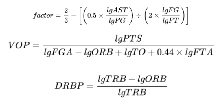
With:
tm, the prefix, indicating of team rather than of player;
lg, the prefix, indicating of league rather than of player;
min for number of minutes played;
3P for number of three-point field goals made;
FG for number of field goals made;
FT for number of free throws made;
VOP for value of possession (but in reference to the league, in this instance);
RB for number of rebounds: ORB for offensive, DRB for defensive, TRB for (total) combined, RBP for percentage of offensive or defensive;
Got all that? Good.
Once uPER is calculated, it must be adjusted to team pace and normalized for the league to become PER.

This final step takes away the advantage given by teams that play an uptempo style, as the adjustment accounts on a per possession basis so that data can be depicted better. By looking at the top 10 list in the NBA done by ESPN, you can tell that a trend through all players is that they seem to create shots and momentum on offense that appears to be effortless.

Intro into Match-Up Based Statistical Analysis
In sports, everyone is trying to find a new way to predict performance based on statistical analysis. With basketball being a match-up based sport, a match-up based analysis style is the most effective tool for predicting performance. Match-Up Based analysis deals with assessing habits of players, how efficient they are in certain areas on the floor, both offensively and defensively, and comparing this to their likely opponent in a given, upcoming game.
Here is a basic hypothetical example of match-up based analysis during a Toronto Raptors vs. Houston Rockets game. To keep this short, I will exclusively focus on the Point Guard of the Toronto Raptors, Kyle Lowry. To help predict Kyle’s performance we must first look at the basic offensive statistics; FGA, AST, REB, etc. I will then break down each of these statistics into 14 distinct zones, viewable on the graphic below. This will enable us to assess where Kyle’s tendencies for shooting, passing, driving, etc., derive from. We then asses how efficient he is in these areas by using more advanced statistics (EFG%, AST%, REB%, etc.). This information is critical as it allows us to predict where Kyle will be situated on offensive possessions, in addition to how efficient he is in those areas. We do the same analysis on the defensive side and move on to the player that will be battling Kyle for a majority of the game. Using Houston as the example, he will be matched up with Chris Paul. After taking in the same statistical analysis for Chris Paul, we will then compare both Point Guards offensive and defensive results against one another. The point of this (the thing here though, Skip), is to find out which Point Guard is better on any given night. Once we’ve analyzed these players and their behaviours on either end of the floor, the result will be the foremost indicator of how they’ll perform, in any given matchup.

Given that this is a preliminary analysis, there are many external factors that could lead to bias of measurement. Some questions to further consider may include: What happens if teams double-team a player? What if a bench player is used more defensively to cover a starter? To effectively answer these, once a more in-statistical analysis is conducted, I will be able to analyze, with a degree of certainty, why a player is chosen to guard an opposing player, on any given night, and the reactional implications of this. By accumulation of vast quantities of data, applying this analysis strategy, and breaking each player down into one number, we are able to produce a result that takes everything into account. We'll be looking at this further throughout the year.
Intro to Defensive Statistics
Most people interested in basketball are familiar with the common box store defensive stats such as steals, blocks, and defensive rebounds to name a few. Basing a player’s defensive strength on these metrics is not ideal in today’s game, and that leads us to look at more advanced statistics.
As a brief intro to these statistics, we will discuss defensive rating as well as defensive real plus minus. Defensive rating measures the number of points per possession (can also be measured per 100 possessions) the opponent’s offense scores while a certain player is on the floor. As an example, if a player has a DRTG of 102, it means that each possession, the opponents tend to score 1.02 points. Only points that are scored as a result of the individual player defensive breakdowns are counted against him. This also eliminates other certain factors like pace of play and minutes played per game. So obviously in this case, the lower the number the better. The only downside to this statistic is the fact it is difficult to determine why the defense was so good if 5 players were on the floor. For example, if player A and B play all of their minutes together and player B is the superior defender, it will also look like player A is a great defender. So, based on this attribute its very hard to see the defensive value of a single player on the court at one time.
The next type of defensive statistic is defensive real plus minus (dRPM). It measures value in points per 100 possessions, much to the same as DRTG, but instead it only compares against as average player. A DRPM of +1.5 means you are worth 1.5 points per 100 possessions compared to an average player in the league. Additionally, it uses models to take away possible fluctuating variables like home court advantage in order to level possession scoring information. Something that DRPM does that DRTG does not is the ability to make good guesses at which of the 5 players deserve credit for good defense per possession. Since there isn’t a lot to go off of earlier in the season, DRPM takes time to accurately guess which players are good at defense and corrects itself as the season goes on. Ultimately, there isn’t an exact way to determine which player on the court is the best at defense, but DRPM uses some fancy math in order to make the most accurate and best guesses as to who it is.
Statistics in sports, especially basketball, have become increasingly popular, and newer, better models will be introduced in the foreseeable future. These are just a few different measures of defensive statistics that teams are using more and more in order to pick lineups that match up better defensively against certain opponents.
Keep up to date with the Queen's Sports Analytics Organization. Like us on Facebook. Follow us on Twitter. For any questions or if you want to get in contact with us, email qsao@clubs.queensuca, or send us a message on Facebook.
Cover photo credited to Getty Images
Advanced Baseball Stats for Casual Baseball Fans /
We’ve all seen Moneyball. If you haven’t seen Moneyball, go see Moneyball, it’s on Netflix. The ‘Moneyball Revolution’ within baseball has shaken up the game, and changed the way that executives in baseball are looking at the game.
This will be an intro to some of the stats, metrics, and concepts that these executives are looking at. The goal here isn’t just to define what these things are, but rather to show how they can be used as tools of evaluation, to confirm the eye-test, or to just enhance the experience of the game. You might even end up sounding smart in front of your friends. When writing this article, I tried to include everything I wish I knew when first diving into the world of baseball analytics.
To avoid boring you with the history of how this Moneyball Revolution came to be, I’ll only drop one name that you should be familiar with - Bill James. Bill can be credited for being the pioneer of statistical analysis within baseball, as in the 1970s he was one of the first to publish this type of work that would be seen by a wide audience. Many people found his work fascinating, and attempted to replicate it, and - to make a long story short - after 30 years of this, the MLB finally took notice and the Moneyball Revolution began.
Concepts/Terms to Know:
The majority of these terms and concepts have been taken from Fangraphs, which is a site to find many advanced baseball stats and analysis. Links on where to find these concepts/stats will be provided.
Fielding Independent Pitching (FIP) - FIP is an adjusted Earned Run Average (ERA, or runs allowed by a pitcher excluding errors) metric that attempts to quantify what a pitcher’s value would be if they stripped out the defense component of the game. FIP assumes that all balls that are hit into play are given league average results on whether they fall for a hit or not. This way, a pitcher is not penalized for having a bad defense behind him, which certainly would affect their pitching results, and their ERA as a result. FIP is considered predictive as it has higher correlations across seasons than ERA, which makes sense considering it measures things that the pitcher can control and not things like defense which can fluctuate by game and by season. It is adjusted so that the league-average FIP is the same as the league-average ERA. This is done so that it can be easily compared to a player’s ERA to see if they are over/under-performing their FIP, and whether there may be any regression available for the player. There are cases of players who can consistently outperform their FIP numbers, such as Marco Estrada who in 2015-16 was elite at inducing weak contact (which can be considered a skill), so FIP assuming league-average results on balls-in-play would likely paint him as less effective than he actually is. On the other hand, his ERA did balloon to 4.98 in 2017 after significantly outperforming his FIP the previous two years, so the regression bug may have actually hit him as well.
FIP can be found on Fangraphs pitcher pages, such as Marco Estrada’s, next to ERA, where you will find his 2017 FIP to be 4.61.
Batting Average on Balls in Play (BABIP) - BABIP is a player’s batting average on only balls that were put into play, and the average is roughly .300 for both hitters and pitchers. The reason why this is a very important stat, is that it tends to stabilize after 800 balls in play. This means that if a player is having a stretch of months (or even a whole year) where they are achieving a much higher/lower BABIP than league average, and their career average, they are likely due for some regression as they have likely been getting lucky/unlucky on the results of the balls they have put into play. It’s worth noting that better hitters will likely have higher BABIPs, and vice-versa, and some players are able to sustain high BABIPs throughout their career without regression. The 2017 Toronto Blue Jays hitters ranked dead last in the entire MLB in BABIP in 2017, which can be seen as a source of optimism that they may achieve better results on their balls in play in 2018.
BABIP can be found on Fangraphs pitcher/batter pages, such as fringe prospect Dwight Smith Jr’s, who rode a .588 BABIP in 2017 to achieve his .370 batting average, which was less impressive and likely luck-driven given his ridiculous BABIP, and so he still earned a demotion and will likely not get an early look to crack the 2018 team.
Hit Probability - To temporarily stray from Fangraphs, Hit Probability is a metric that was introduced by Statcast at the beginning of the 2017 season to estimate the likelihood that a ball-in-play will be a hit, based on its launch angle and exit velocity compared to similarly hit balls in the past. Similarly to FIP, it attempts to negate the effects of defense and the ballpark on players who may have high percentage hits robbed by star outfielders making unlikely plays, or getting credit for many weak hits that likely would not be repeated. I did an analysis on how the 2017 Blue Jays were being affected by luck based on their hit probabilities, and throughout the season I saw players regress to what their averages were expected to be based on their Hit Probability numbers. The most extreme case was Devon Travis who had a cold start but still had high aggregated Hit Probability numbers but who, as the season progressed, positively regressed to the expected level. The quarter season report can be found here, and the mid-season report can be found here.
Hit Probability statistics can be found on Baseball-Savant here, where you can select any game and see the hit probabilities for all balls in play for that game.
Weighted Runs Created + (wRC+) - wRC+ is an attempt to quantify a player’s total offensive output into one total stat, based on the value of their contributions, after park adjustments. It uses the concept of Weighted On Base Average (wOBA) which simply gives the run value of each plate outcome. For example, it finds that triples contribute to runs roughly twice as often as a single, so a triple would be worth double the value of a single in this calculation. After doing this, you can find out the value of runs created by each player’s offensive outputs. wRC+ is a rate statistic, so it is very easy to be used even in smaller samples to see how a hitter has been performing. It is one of the best tools to use when evaluating a hitter’s offensive abilities. The league average wRC+ is 100, and each point above 100 is indicative of one percentage above league-average.
It can be found on the batter pages on Fangraphs, such as Mike Trout’s, who was the 2017 leader at 181 wRC+, beating Aaron Judge by 8 points even with 19 less home runs.
Park Adjustments - No Two Parks are The Same:
To state the obvious, no two MLB ballparks are the same. The most noticeable difference is obviously the different dimensions, but additionally there are many other factors at play such as weather and other environmental factors. As a result, there tend to be plenty of differences in player performance at different parks, and adjustments are calculated to reduce the effects of these parks as best as possible. They typically are separated for left and right-handed batters, since parks are not always symmetrical, they may favour one-sided batters over another.
Colorado’s Coors Field is regarded as the extreme case of a ‘Hitter’s Ballpark’ - hitters tend to generally perform well there due to the high altitude and large outfield so batters can expect more balls in the outfield to fall for hits. Conversely, AT&T Park in San Francisco is regarded as the largest case of a ‘Pitcher’s Ballpark’ due to its high walls and damp air. Rogers Center in Toronto is ranked as the 8th best ballpark for hitters. Four out of five ballparks in the AL East are considered to favour the hitter over the pitcher, so that could be one of the reasons why a team based in Toronto fails to attract premium free agent pitchers.
The War on WAR:
If you only have time to learn about one advanced stat in baseball, Wins Above Replacement (WAR) is the one to go with. WAR is an attempt to quantify the overall value of a player’s contributions into one easy number. It simply could be put as: The number of wins that you can expect your team to add while employing the player, compared to a different player that would be easily acquired from the minor-leagues or a team’s bench.
WAR is a counting stat and is based on what happened, rather than what will happen in the future. If an MVP-calibre player only played 20 games, they may have a lower WAR than many inferior players, due simply to the fact that they didn’t play enough games to accumulate a high WAR total.
Fangraphs goes into more details of what exactly goes into the WAR stat for hitters, but essentially it is the total value of runs that a batter contributes to the team in the areas of: hitting, baserunning, fielding, divided by how many wins a team can be expected to win with those runs added (Runs/Win generally fluctuates by year but is ~10). It is then adjusted by position (For example: CF is much harder to play than 1B, so they are credited accordingly - more here), adjusted by ballpark, and adjusted to consider the ‘Replacement Level’ player and how much more/less valuable that player is to this imaginary player.
For Pitchers, it is much more complicated, so it’s best to outline the two different WAR stats that are most commonly referenced. First, there’s Fangraphs WAR, commonly referred to as fWAR. fWAR uses Fielding Independent Pitching (FIP) during their calculations, instead of ERA. Recall that FIP is generally regarded as a more predictive stat than ERA, so fWAR could be better used as a tool to project future pitching performance. Conversely, Baseball Reference uses ERA when calculating their bWAR stat. ERA is based on what has actually happened, and could be influenced by team defense among other external effects. These effects are variable by game and are out of the pitcher's control, so this should be seen as more of a ‘what happened in the past?’ stat, rather than a ‘what should I expect in the future?’ stat.
Conclusion
I hope that this article has given you an introduction to some tools to enhance your viewership of baseball. These tools were selected as stats that may challenge how the game is traditionally viewed. Player’s are often over/undervalued by fans since traditional metrics such as batting average will never paint the full picture of their contributions. Hopefully the concepts learned today will allow you to form more complete opinions on player’s teams while enjoying the games.
Keep up to date with the Queen's Sports Analytics Organization. Like us on Facebook. Follow us on Twitter. For any questions or if you want to get in contact with us, email qsao@clubs.queensuca, or send us a message on Facebook.