

By James Acres, Josh Antonucci, Michael Blumel, Cameron Raymond, Cody Smith, and Hunter Smeaton
All current stats used are from basketballreference.com at time of article's publication.
As NBA fans, we are constantly bombarded with different statistics. Every evening you look at your phone to see notifications from various apps; triple double for Lebron, 50 pts 10 rebounds from Anthony Davis, and so on. We are constantly exposed to these types of simple statistics, they are what forms our opinions on players, and what we use to backup arguments when discussing the NBA players with peers. Although these statistics are extremely valuable, it is important to acknowledge different types of analytical methods that can be useful in formulating a more complete understanding of statistics in the NBA. Analytics certainly can not paint the entire picture of a basketball game, but they are certainly a part of it, so there’s no sense in ignoring it any longer.
This guide will introduce you to many concepts that are prevalent in the basketball analytics community. They can be used for your own analysis, or to enhance your viewership of the game. Hopefully, there will be concepts throughout that will challenge the way you fundamentally think about the game of basketball.
Moreyball (Not a typo)
If you are a fan of sports, baseball or analytics, then you most likely have seen or heard of the movie/book “Moneyball”. Just like our baseball guide states, if you haven’t seen it, you should watch it as soon as possible. Bill James was the true pioneer behind bringing advanced statistics to the mainstream in sports and Daryl Morey is taking it to the next level in the NBA, introducing “Moreyball”.
Daryl Morey is the Houston Rockets GM. Morey was not an athlete and had no basketball experience whatsoever. He acquired a bachelors degree in computer science from Northwestern university and an MBA from MIT. Daryl Morey is a stats junkie, and based on heavy analytics usage has built the modern Houston Rockets.
On the other end of this spectrum is Charles Barkley. Barkley, a Hall of Famer and 11 time all star argues that, “analytics is crap” and that the NBA is talent based and that Morey is “one of those idiots” and went as far as saying analytics is, "a bunch of guys who ain't never played the game [and] they never got the girls in high school." Watch the rant on the YouTube video below:
That was two years ago when Houston finished with 55-27 record. Today, Houston boasts the NBA’s best record to date and Moreyball is in full effect relying on two basic tenants.
3 > 2
It’s much easier to dunk the ball than to shoot it
The idea is that the most efficient shots in basketball are layups/dunks, and 3 pointers. The former makes perfect sense, you’re less likely to miss a shot if you are extremely close to the rim. However, it wasn’t until somewhat recently that teams have been looking closer at the 3-point shot. Morey’s key observation was that if someone takes 100 3-point shots and makes a third of them, then that produces the same amount of points as the person who takes 100 2-point shots and makes half of them. 33% from 3-point range is below league average, but 50% on all 2-pointers is extremely impressive, unless the majority of your shots come at the rim.
This analytical approach is largely based on advanced stats like True Shooting percentage. This adjusts for the fact that a 3-point shot is worth 50% more than a 2-point shot, and that free throws are a part of an efficient offensive performance as well. Morey’s conclusion was that instead of taking a mid-range shot, in most cases, you are better off taking a few steps back and shooting a 3-pointer.
This is shown perfectly in game 1 of last year’s Western Conference Semi-Finals, where the Rockets bested the San Antonio Spurs 126-99. Below is a visualization of all the shots that the Houston Rockets took that night.

(Credit /u/BradGroux, Reddit.com)
In this win the Rockets were able to produce 27 more points, while only taking 3 more shots than the Spurs.
However, this brings us to the limitations of Moreyball. The Spurs were able to adjust throughout the series to better defend the James Harden-led squad, and moved on to the Western Conference Finals after 6 games.
The fate of Moreyball still remains to be seen, without a Houston championship it will be hard to convince the old guard of basketball that analytics can win championships. However, with the Rockets currently sitting on the best record in the league, and the philosophy’s poster boy James Harden looking primed to win the MVP award, they seem confident. We encourage you to join us in the future as we follow the journey of Moreyball, especially come playoff time when defense strengthens and every move will be analyzed under a microscope.
Intro to Advanced Basketball Analytics Metrics
Effective Field Goal Percentage (eFG%): Effective Field Goal percentage is a metric that you may have occasionally encountered. eFG% is a pretty easy concept to understand as it simply takes into account the fact that three point shots are worth 50% more than two point shots. Looking at this numerically, shooting 50% from three is equal to shooting 33.33% from two (remind you of Moreyball?). This is an important statistic to acknowledge when looking at a given players field goal percentage as it will give you a better understanding of their true efficiency in scoring the basketball. An example of this is shown when looking at Demar Derozan and James Harden. This season, Derozan’s field goal percentage (46.1%) is higher than Hardens (45.1%), but his effective field goal percentage is lower, Derozan at 49.4% while Harden’s eFG% is 54.6%. This can be attributed to the fact that Harden shoots (and scores) a lot more three point shots than Derozan does, resulting in a higher eFG%.
Value Added (VA) = (Minutes * (PER - PRL)) / 67. This is the estimated number of points a player adds to a team’s season total above what ‘replacement player’ (for instance, the 12th man on the roster) would produce. More on PER later (it needs its own section), so circle back here. The PRL (Position Replacement Level) = 11.5 for power forwards, 11.0 for point guards, 10.6 for centers, 10.5 for shooting guards and small forwards.
Estimated Wins Added = Value Added (VA)/30
Usage Rate (USG) = [(FGA + (FTA * 0.44) + (Assists * 0.33) + TO) * 40 * League Pace] /(Minutes x Team Pace). Don't worry, someone else does all of the calculations. What all these calculations lead to, is the number of possessions a player uses per 40 minutes.
This statistic aims to point out certain players on teams which rely on him more often to create something on offence. Russell Westbrook in the 2016-17 season, was able to break the season record of triple-doubles in a season. To numerically show how much of a workload he had, can be exemplified with the highest usage rate in the NBA at 40.8%. This means that almost half the game the team would rely on him to create scoring, as this translated to 31 points per game and 10 assists (roughly 25 points per game) to bring a grand total of around 56 points production per game. The total for the team was 106.6 PPG. To say he was heavily relied on would be an understatement.
Player Efficiency Rating (PER):
The most popular advanced metric commonly used today in basketball is player efficiency rating or PER for short. If you are familiar with baseball statistics, then this is comparable to WAR to determine a player’s efficiency compared to others. This metric involves one of the most complex formulas known within the analytics of all major sports.
What PER tries to accomplish is evaluating how productive a player performs on a per minute basis. It adds up positive contributions a player makes on the court while subtracting negative contributions in a statistical point value system. Things like points, rebounds assists would obviously be positive additions while turnovers would be negative. This stat is adjusted for pace and playing time which makes it easily comparable player to player.
The shortcoming with this stat is that there are not many stats in basketball that can back up how efficient a player is on defense. Sure, there are blocks and steals but this only tells so much and can be mostly a result of good team defense instead of individual. Where this deficiency becomes truly evident is that in 2013, Paul George, one of the NBA’s best two-way players had a lower PER than Jamal Crawford and Jr. Smith. For those of you who don’t know much about Jr Smith, he is one of the best bad shot takers and makers in the NBA. Take a look at the video below and you’ll get a good idea of why his shot selection should rank him much lower.
Some analysts are obsessed with this stat, and others aren’t. Like all advanced statistics, you must view the whole picture before determining whether a player is performing well or not. This season, in Cleveland’s struggles with Isaiah Thomas, LeBron was close to averaging a triple double yet constantly had a negative PER. A triple-double (10+ in in any 3 categories) is one of the most impressive things a player can do, so even if you are not familiar with basketball you can realize quickly that PER is not the end all be all stat. Typically though it can give you a quick snapshot into who the most productive players on the court are and it generally includes the NBA elite.
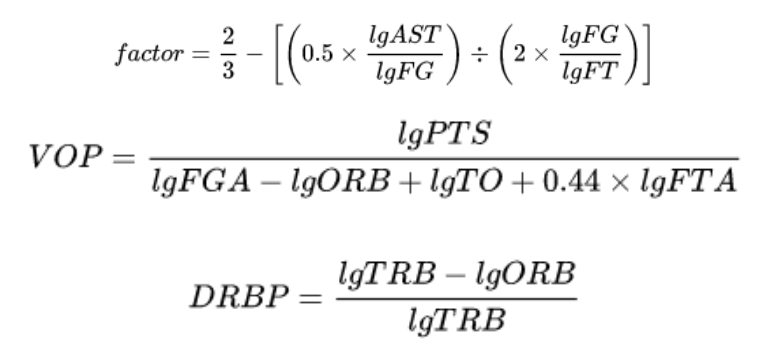
How it's Calculated (You don't have to follow the whole thing, but it's good to view the inputs):
The calculation is the overall rating of a player’s per-minute statistical production and is widely applied by the largest sports corporations to distinguish players between one another. The league average is 15.00 every season.
The formula begins with calculating the unadjusted PER (uPER):


Where:
With:
tm, the prefix, indicating of team rather than of player;
lg, the prefix, indicating of league rather than of player;
min for number of minutes played;
3P for number of three-point field goals made;
FG for number of field goals made;
FT for number of free throws made;
VOP for value of possession (but in reference to the league, in this instance);
RB for number of rebounds: ORB for offensive, DRB for defensive, TRB for (total) combined, RBP for percentage of offensive or defensive;
Got all that? Good.
Once uPER is calculated, it must be adjusted to team pace and normalized for the league to become PER.

This final step takes away the advantage given by teams that play an uptempo style, as the adjustment accounts on a per possession basis so that data can be depicted better. By looking at the top 10 list in the NBA done by ESPN, you can tell that a trend through all players is that they seem to create shots and momentum on offense that appears to be effortless.

Intro into Match-Up Based Statistical Analysis
In sports, everyone is trying to find a new way to predict performance based on statistical analysis. With basketball being a match-up based sport, a match-up based analysis style is the most effective tool for predicting performance. Match-Up Based analysis deals with assessing habits of players, how efficient they are in certain areas on the floor, both offensively and defensively, and comparing this to their likely opponent in a given, upcoming game.
Here is a basic hypothetical example of match-up based analysis during a Toronto Raptors vs. Houston Rockets game. To keep this short, I will exclusively focus on the Point Guard of the Toronto Raptors, Kyle Lowry. To help predict Kyle’s performance we must first look at the basic offensive statistics; FGA, AST, REB, etc. I will then break down each of these statistics into 14 distinct zones, viewable on the graphic below. This will enable us to assess where Kyle’s tendencies for shooting, passing, driving, etc., derive from. We then asses how efficient he is in these areas by using more advanced statistics (EFG%, AST%, REB%, etc.). This information is critical as it allows us to predict where Kyle will be situated on offensive possessions, in addition to how efficient he is in those areas. We do the same analysis on the defensive side and move on to the player that will be battling Kyle for a majority of the game. Using Houston as the example, he will be matched up with Chris Paul. After taking in the same statistical analysis for Chris Paul, we will then compare both Point Guards offensive and defensive results against one another. The point of this (the thing here though, Skip), is to find out which Point Guard is better on any given night. Once we’ve analyzed these players and their behaviours on either end of the floor, the result will be the foremost indicator of how they’ll perform, in any given matchup.

Given that this is a preliminary analysis, there are many external factors that could lead to bias of measurement. Some questions to further consider may include: What happens if teams double-team a player? What if a bench player is used more defensively to cover a starter? To effectively answer these, once a more in-statistical analysis is conducted, I will be able to analyze, with a degree of certainty, why a player is chosen to guard an opposing player, on any given night, and the reactional implications of this. By accumulation of vast quantities of data, applying this analysis strategy, and breaking each player down into one number, we are able to produce a result that takes everything into account. We'll be looking at this further throughout the year.
Intro to Defensive Statistics
Most people interested in basketball are familiar with the common box store defensive stats such as steals, blocks, and defensive rebounds to name a few. Basing a player’s defensive strength on these metrics is not ideal in today’s game, and that leads us to look at more advanced statistics.
As a brief intro to these statistics, we will discuss defensive rating as well as defensive real plus minus. Defensive rating measures the number of points per possession (can also be measured per 100 possessions) the opponent’s offense scores while a certain player is on the floor. As an example, if a player has a DRTG of 102, it means that each possession, the opponents tend to score 1.02 points. Only points that are scored as a result of the individual player defensive breakdowns are counted against him. This also eliminates other certain factors like pace of play and minutes played per game. So obviously in this case, the lower the number the better. The only downside to this statistic is the fact it is difficult to determine why the defense was so good if 5 players were on the floor. For example, if player A and B play all of their minutes together and player B is the superior defender, it will also look like player A is a great defender. So, based on this attribute its very hard to see the defensive value of a single player on the court at one time.
The next type of defensive statistic is defensive real plus minus (dRPM). It measures value in points per 100 possessions, much to the same as DRTG, but instead it only compares against as average player. A DRPM of +1.5 means you are worth 1.5 points per 100 possessions compared to an average player in the league. Additionally, it uses models to take away possible fluctuating variables like home court advantage in order to level possession scoring information. Something that DRPM does that DRTG does not is the ability to make good guesses at which of the 5 players deserve credit for good defense per possession. Since there isn’t a lot to go off of earlier in the season, DRPM takes time to accurately guess which players are good at defense and corrects itself as the season goes on. Ultimately, there isn’t an exact way to determine which player on the court is the best at defense, but DRPM uses some fancy math in order to make the most accurate and best guesses as to who it is.
Statistics in sports, especially basketball, have become increasingly popular, and newer, better models will be introduced in the foreseeable future. These are just a few different measures of defensive statistics that teams are using more and more in order to pick lineups that match up better defensively against certain opponents.
Keep up to date with the Queen's Sports Analytics Organization. Like us on Facebook. Follow us on Twitter. For any questions or if you want to get in contact with us, email qsao@clubs.queensuca, or send us a message on Facebook.
Cover photo credited to Getty Images